Buy Now Pay Later Checkout Experience
Overview
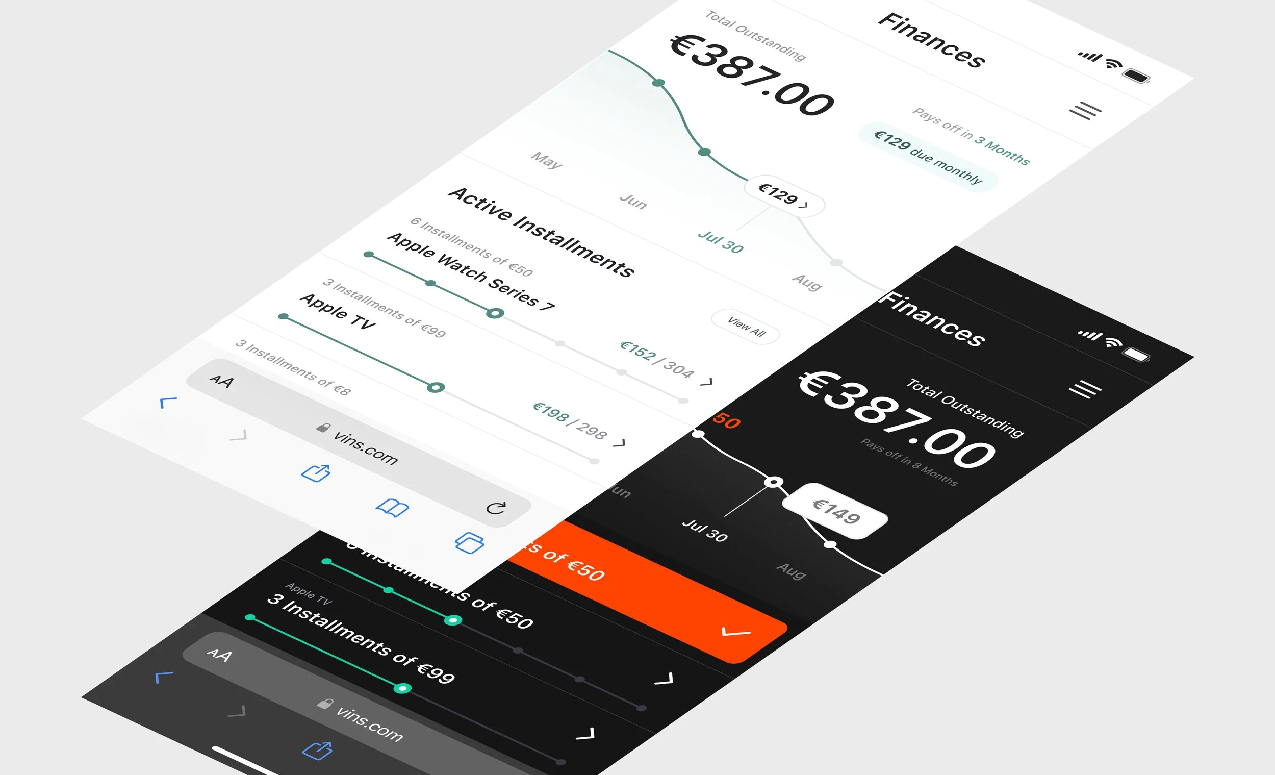
Designed and delivered a Buy Now Pay Later (BNPL) product prototype for Railsr, targeting digital retailers seeking new loyalty strategies. Led the full UX/UI process, creating a high-fidelity, white-label-ready solution that drove a successful client acquisition and integration into Railsr’s fintech offering.
My Roles
01 / Product Designer
02 / UX / UI Designer

Key Contributions

Led all UX/UI design, wireframing, prototyping, and branding in Figma

Developed the fictional “Vins” ecommerce brand to visualize real-world scenarios

Collaborated on user journeys, audience targeting, and competitive positioning

Balanced simplicity and information hierarchy for product user flows

Built an interactive prototype in Figma showcasing key product flows
Outcomes
BNPL prototype successfully pitched and sold, directly acquiring a new client for Railsr
Designs handed off for SDK development and integration into the broader product suite
Demonstrated white-label adaptability, supporting future fintech and retailer partnerships
The Challenge
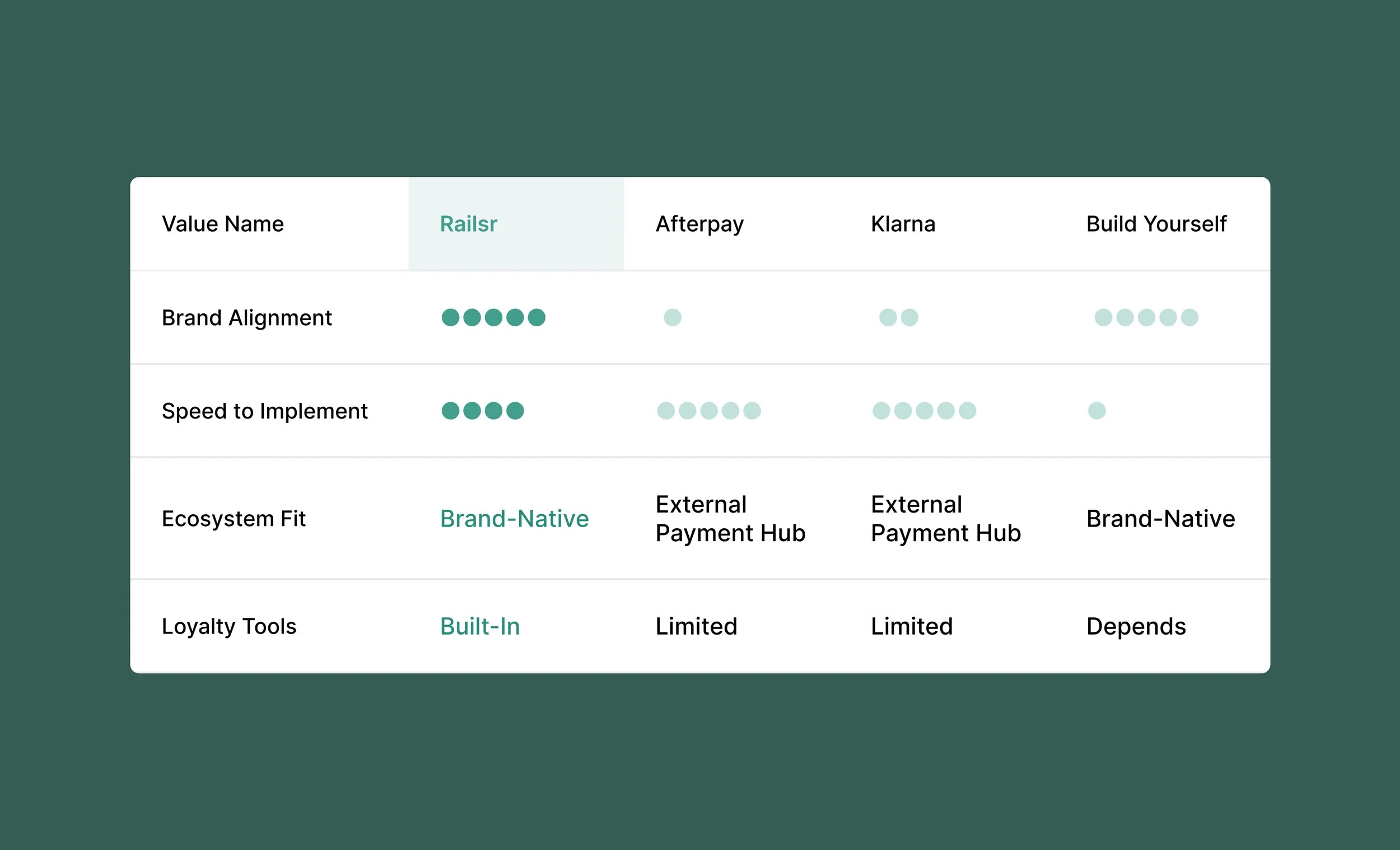
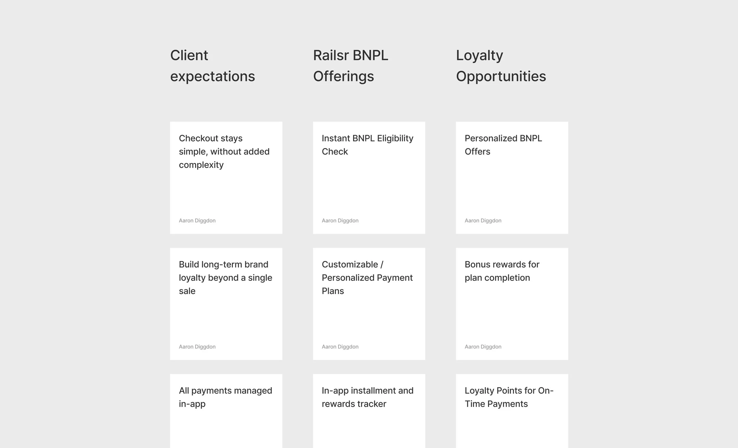
Existing Buy Now Pay Later (BNPL) solutions, like Klarna or Afterpay, redirect customers out of the retailer’s ecosystem, weakening brand loyalty and limiting the retailer’s ability to engage users post-purchase.
Retailers wanted to boost engagement and build brand loyalty through a new financial product
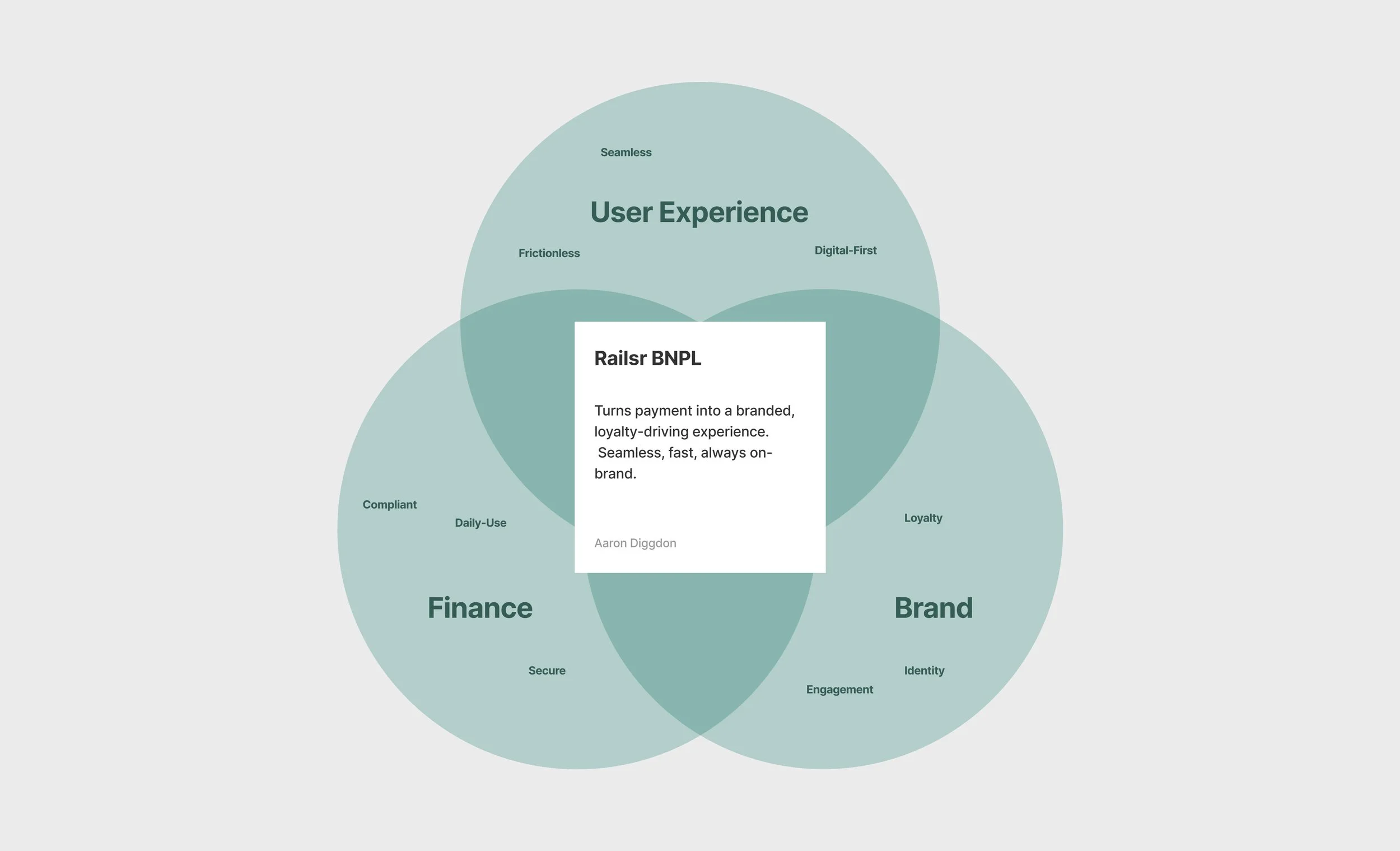
Railsr wanted to offer retailers a white-label solution that would drive engagement through a unified payment and rewards experience.

The Brief
Design and prototype a white-label BNPL product for Railsr, enabling any retailer to integrate branded installment payments, customer rewards, and seamless in-app engagement—delivering a ready-to-pitch solution that drives new business and expands the Railsr product suite.
Research & Discovery
Explored client business goals / needs, interviewed stakeholders, and analyzed BNPL competitors to strategic opportunity for a branded BNPL offering.
Clients consistently expressed the need for embedded financial experiences to foster loyalty and everyday engagement.
BNPL competitors are either unrealistically slow to launch or use a 3rd-party payment’s ecosystem that doesn’t keep customers coming back to a client’s brand.
Our approach: integrate finance, brand, and user experience for a win-win ecosystem.

Target Client
I created Vins—a UK tech retailer persona—to focus product decisions on real business needs, pain points, and digital context, ensuring BNPL would address genuine challenges for Railsr’s clients.
We researched Railsr’s target clients and benchmarked their competitors and digital experiences against leading brands like Argos, IKEA, and Nike.
We prioritized these brands for their market relevance, strong brand loyalty, and user journey simplicity, which we aimed to emulate for Vins.
Vins operates in a highly competitive, low-loyalty online electronics market—making customer retention and brand engagement mission-critical.


Ideation & Solution Framing
Built on Vins’ needs and market pressures, we brainstormed BNPL features and mapped user journeys that support a seamless user experience, foster brand loyalty, and allow simple integration for digital retailers.
User journeys had to be simple and intuitive, so any client could relate.
Prioritized solutions that offered minimal disruption to traditional check-out journeys, while building loyalty through managing payments and rewards.
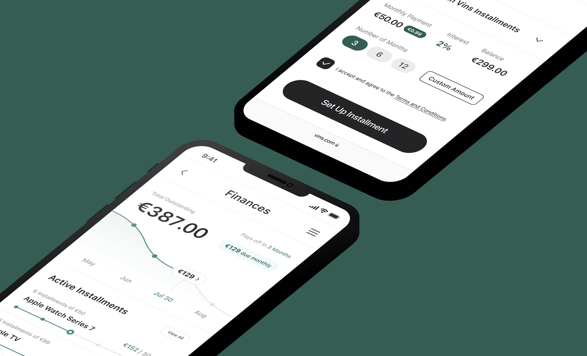
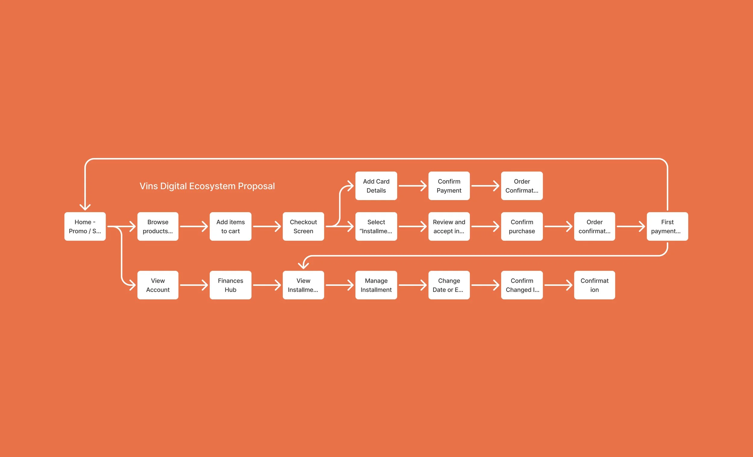
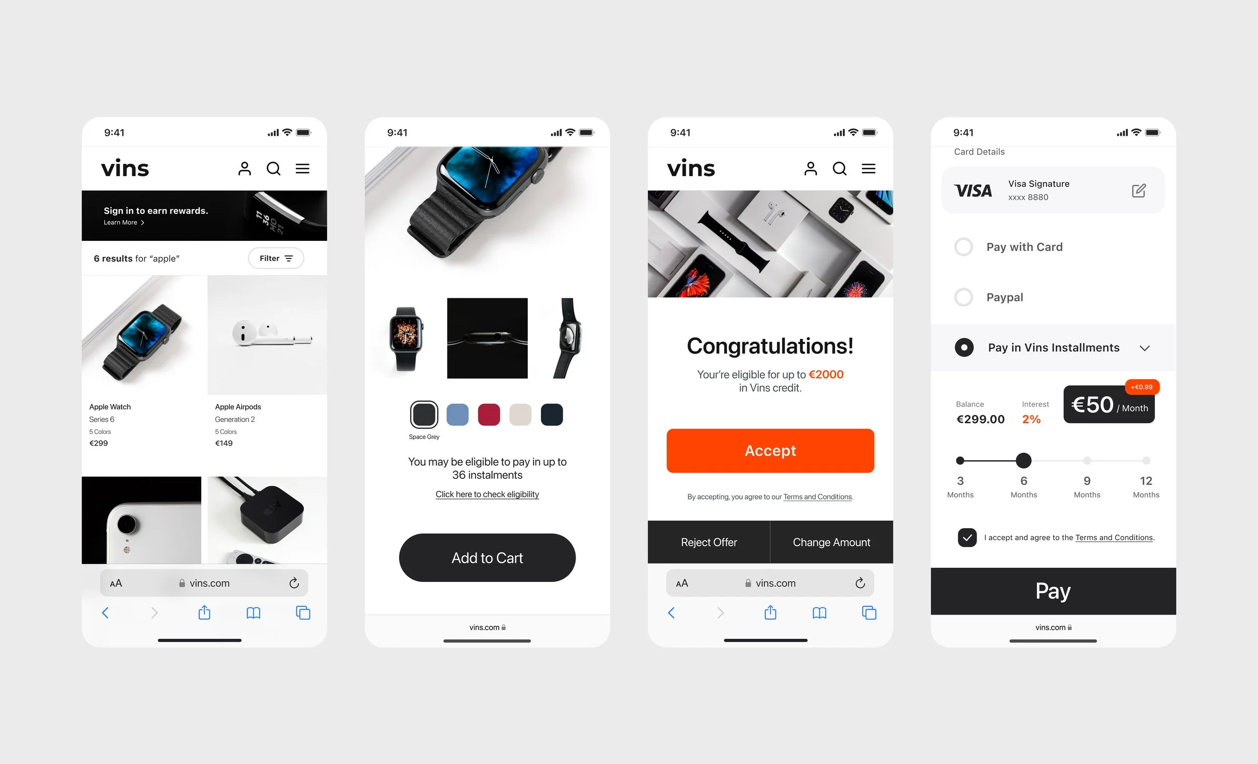
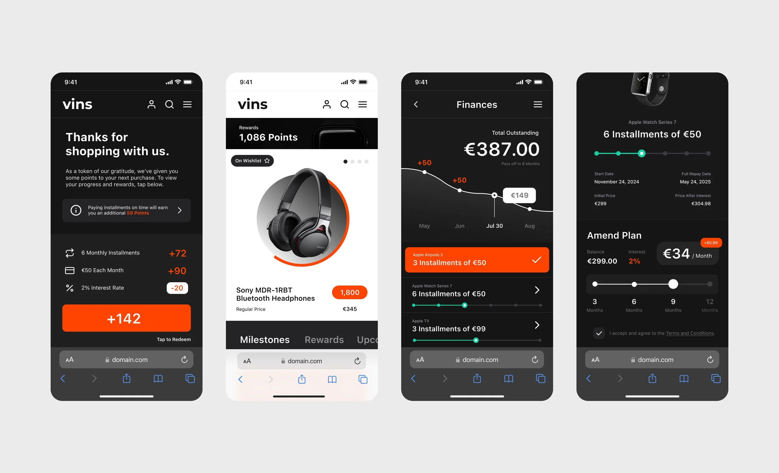
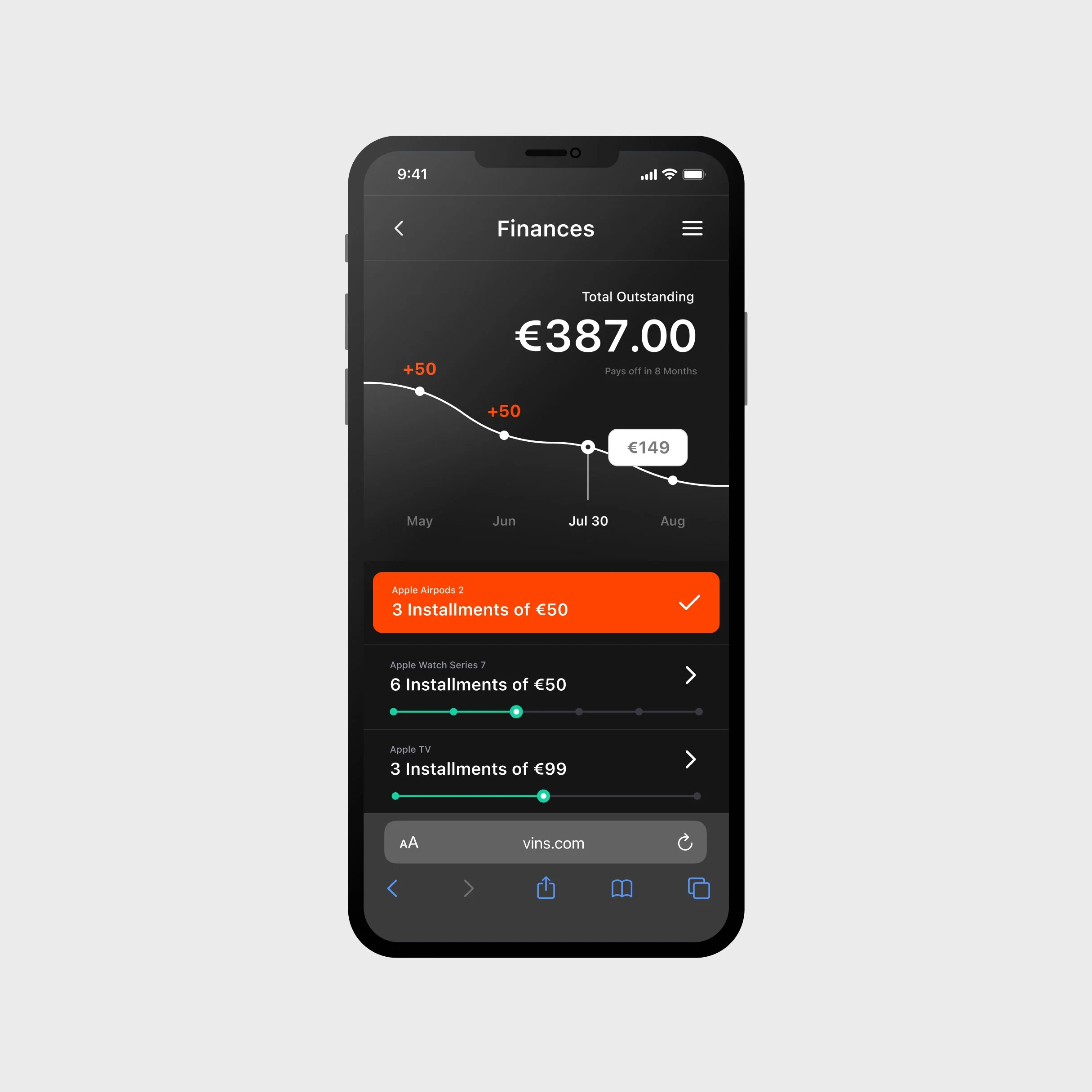
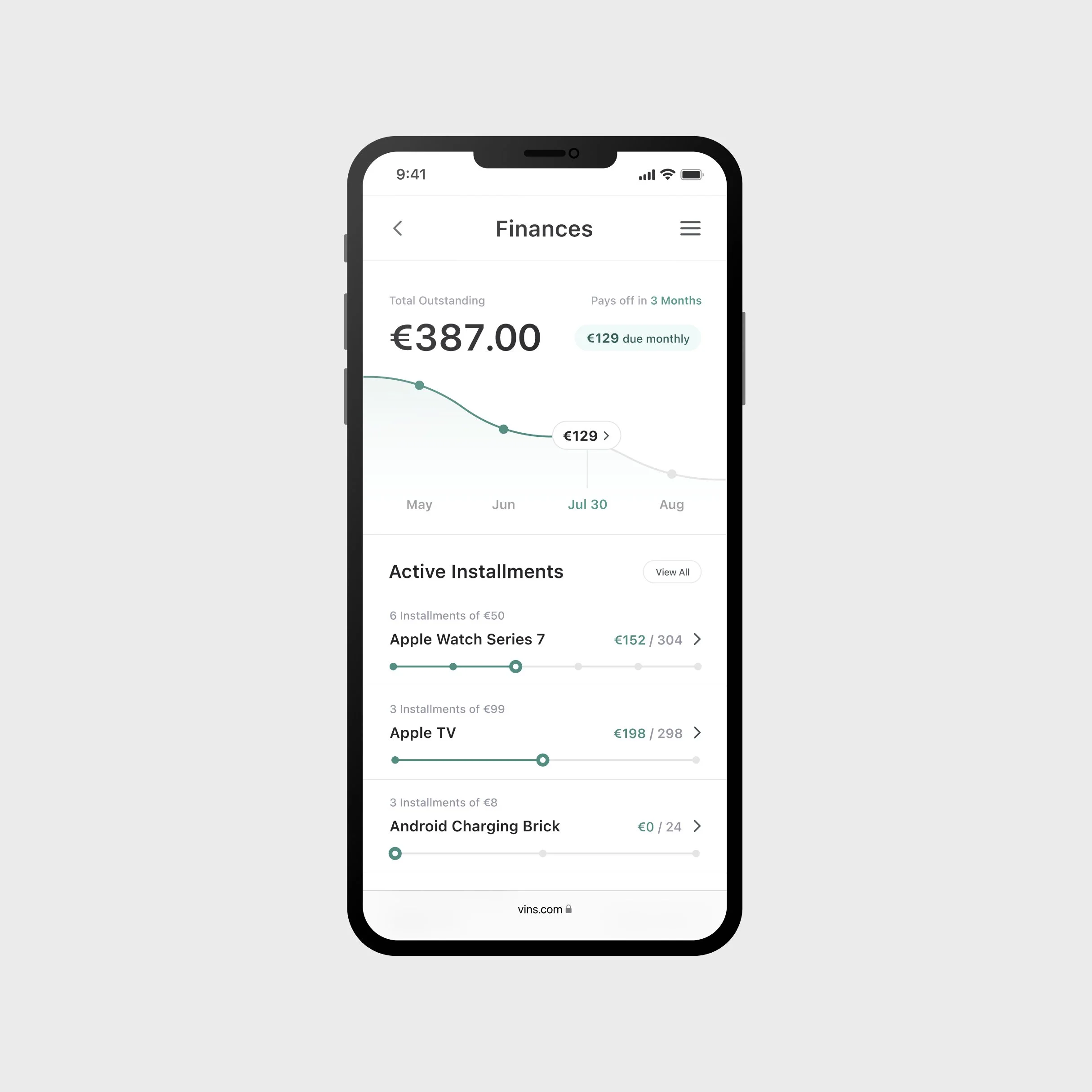
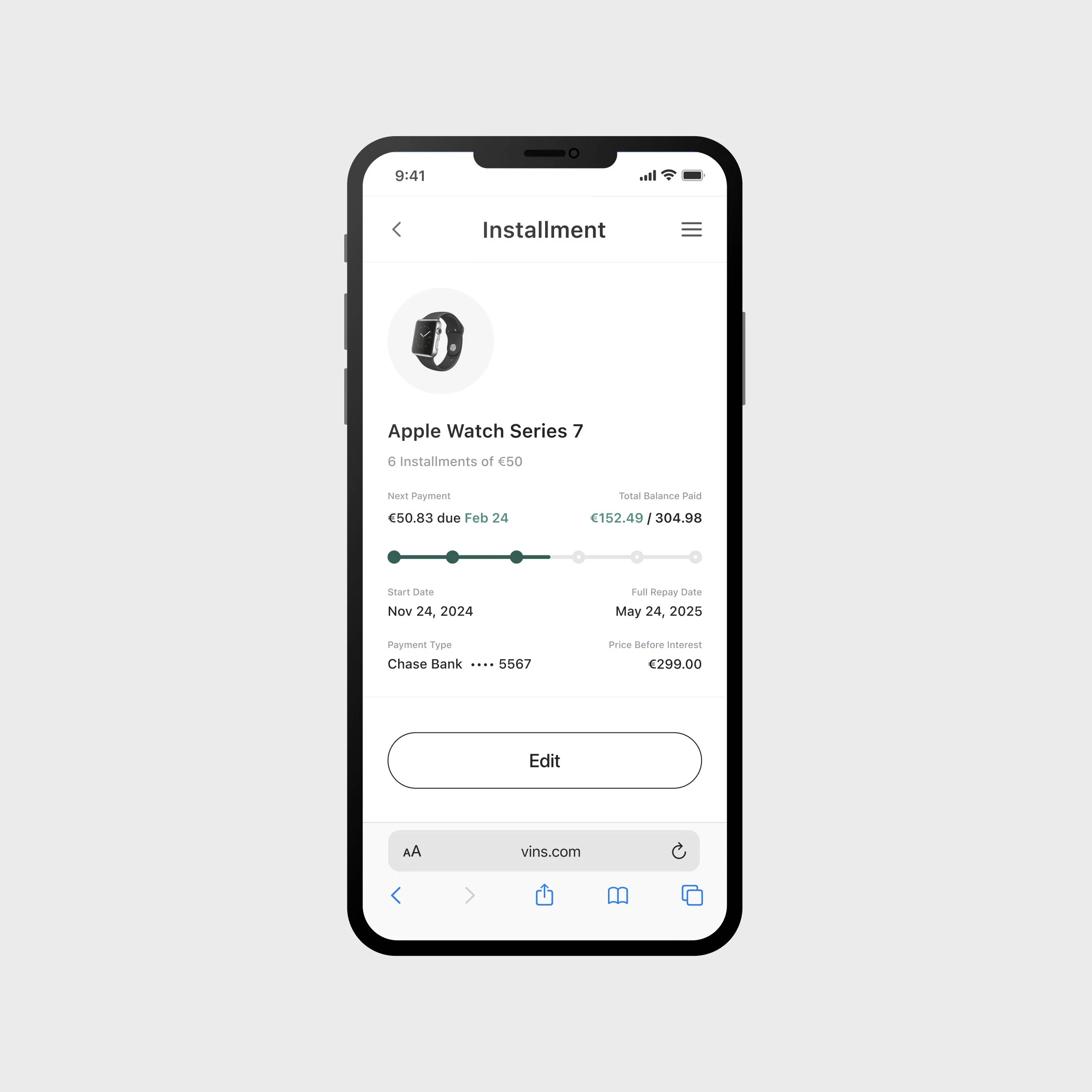
Sketched end-to-end flows where users select BNPL at checkout and manage installments through a finances / rewards hub within the Vins ecosystem.

Wireframing & Key Flows
Developed wireframes to visualize key screens in the flow. Strived to create modular BNPL components inside traditional shopping experiences for client relatability, and only created new flows when needed.
Each decision aimed to project easy adoption, simplicity, and desirability for our target clients.
Focused on emphasizing visual clarity, minimal steps, and visual familiarity for both users and client reviewers.
Balanced user touchpoints per screen with overall journey simplicity, avoiding friction or confusion for clients reviewing the flow.


Early UI Design & Prototyping
Transformed wireframes into a modular design system, applying Vins’ branding. Then built out key flows for an interactive Figma prototype.
Built a flexible design system in Figma to support rapid iteration and ensure brand consistency across all UI elements.
Focused on information hierarchy, clear branding, and intuitive components to display a white-label BNPL experience.
Created an early-version interactive prototype in Figma for testing.
Review & Iteration
Shared high-fidelity prototypes in live walkthroughs with stakeholders, product, and legal teams—rapidly iterating to address usability gaps, compliance risks, and ensure client relatability.
Motivations
I initially explored a dark theme to differentiate shopping from account experiences and highlight Railsr’s offering.
Feedback
Stakeholder feedback found this approach too jarring, so I consolidated the app around a minimalist light theme.

Iteration
I rebranded Vins using a single primary color, making it easy for clients to visualize their own brand. I used this color to draw the attention to CTA’s, necessary information, and subtly towards key Railsr offerings.
Motivations
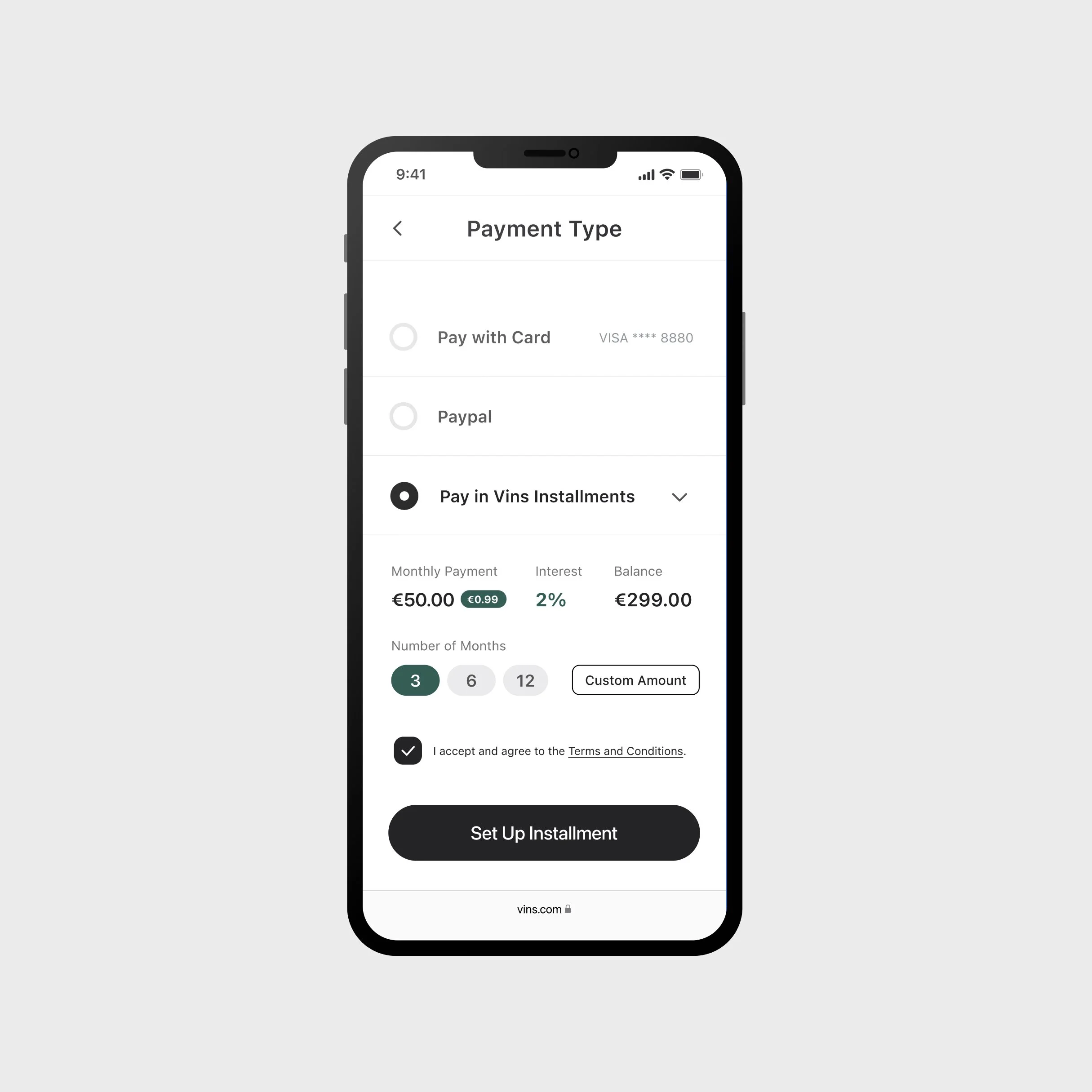
I wanted to create interactive components that would condense key features for quick and easy interoperation.
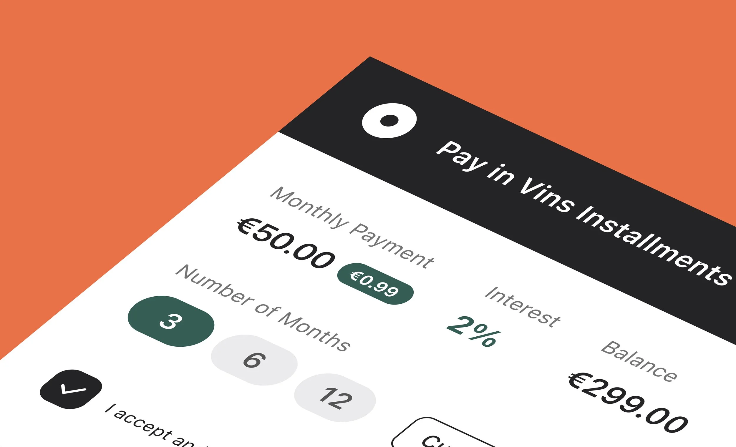
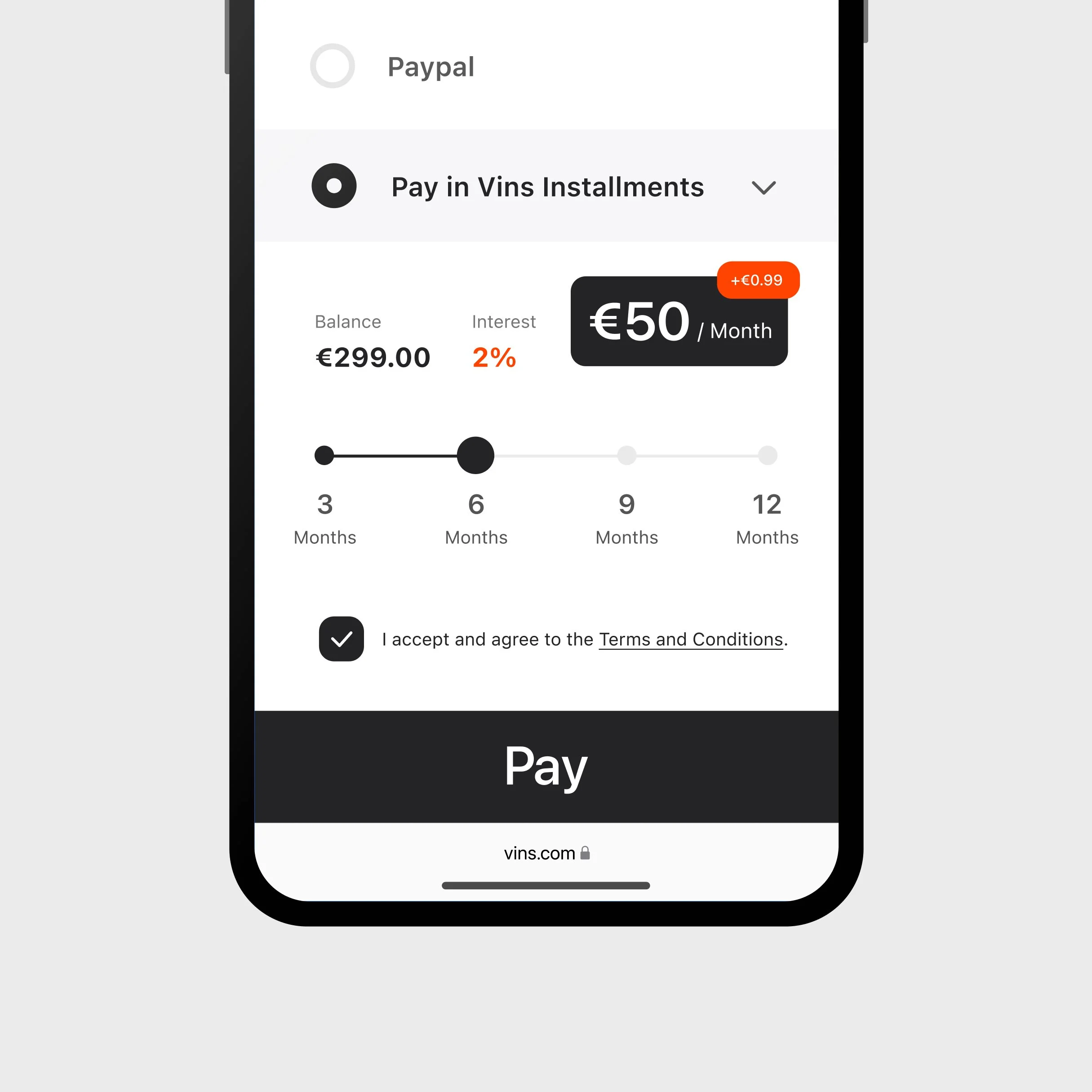
In this example, I designed a “Pay In Installments” component that lets users compare total costs, monthly payments, and interest rates across multiple plans. I created a slider to illustrate the timeline of an installment plan, allowing selection between fixed 3, 6, 9, or 12-month options that visually updating payment details for each plan. The options were fixed at the request legal stakeholders, which was later rolled back.
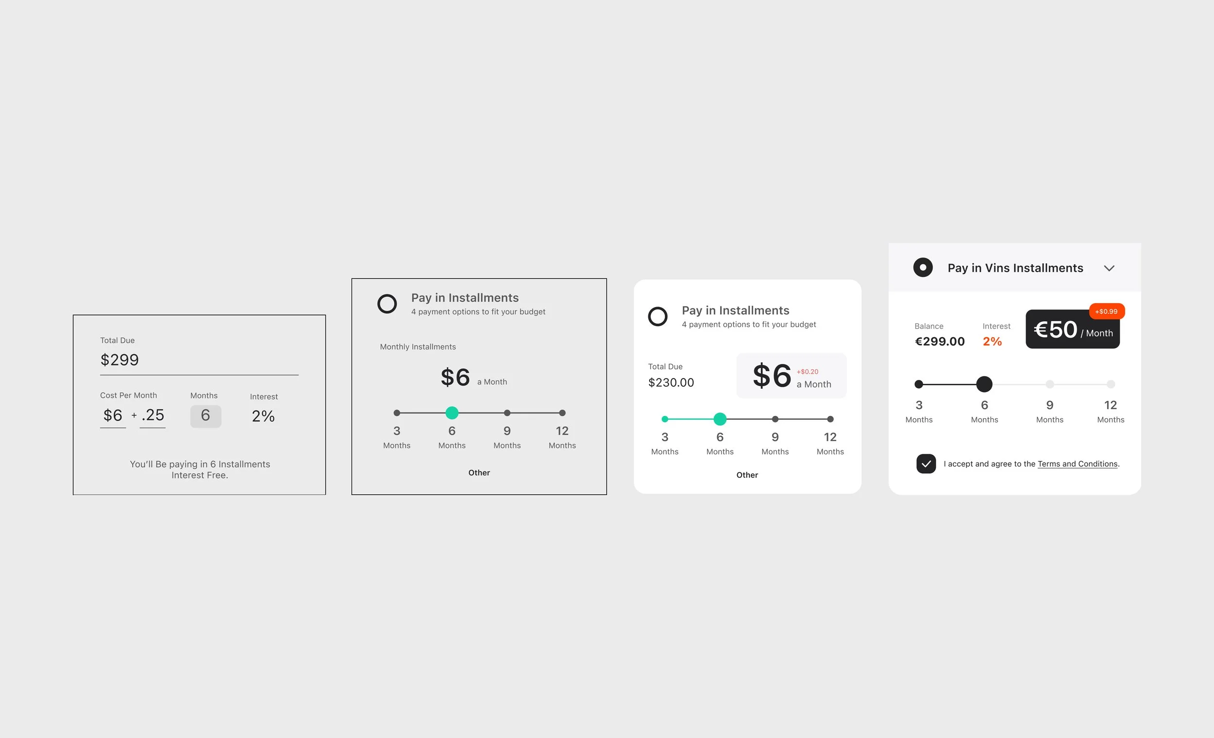
Feedback
Received feedback on potential accessibility issues, inconsistent button styling, and a change in direction on fixed vs flexible payment plans.
Product stakeholders emphasized consistent styling for CTAs, font sizes, and flagged accessibility concerns with the slider. They recommended offering suggested fixed-duration plans while also supporting flexible payment options to appeal to more clients.
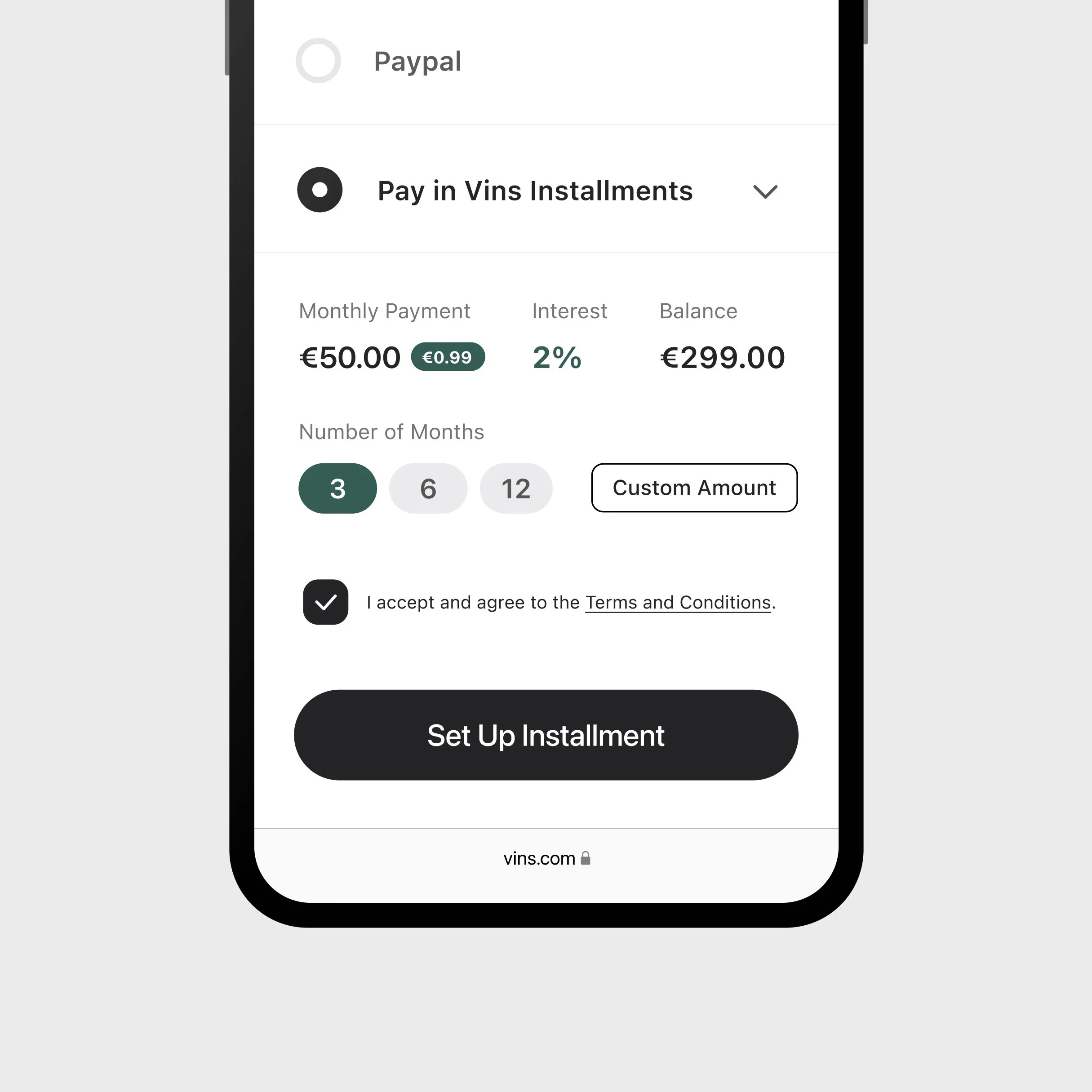
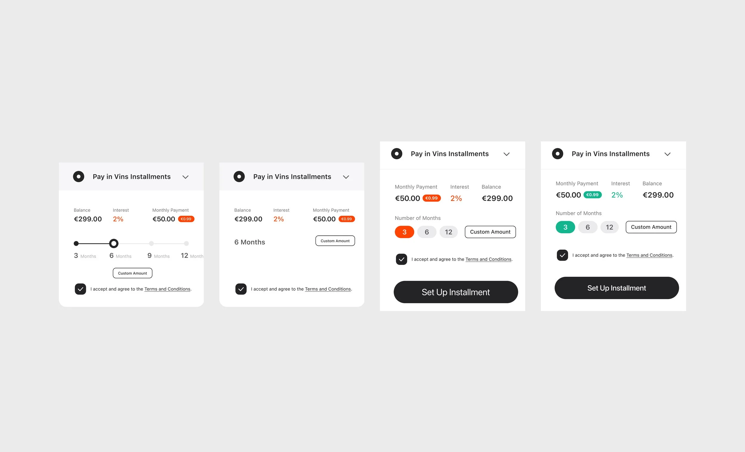
Iteration
Updated user interactions, color, font, and CTA styling for accessibility, full consistency, and a more spacious feel.
Replaced the slider with selectable buttons for three suggested payment plans and added a “choose amount” option for flexibility. Rearranged the visual hierarchy for left-to-right readability and ensured dynamic values adjust clearly as different plans are selected.

Final Handoff & Pitch
Shared and walked through my design flows with C-suite leaders, pitching directly to Railsr’s CEO, CTO, and CRO to align the solution with company strategy and secure buy-in.
Presented the end-to-end prototype in a global standup call with over 50 team members—fielding questions and advocating for key UX decisions.
Explained design rationale, branding choices, and user journey trade-offs to senior stakeholders in real time.
Secured executive approval, setting a clear vision for white-label BNPL and enabling rapid integration into Railsr’s product strategy.
Reflection
This project taught me how to balance design system clarity with business realities, work cross-functionally to manage competing priorities, and present complex solutions clearly to executives—all while ensuring user needs stayed central.
Sharpened my ability to mediate stakeholder demands, translating varied feedback into practical, cohesive solutions.
Gained experience pitching design rationale at an executive level and leading design reviews with clarity and impact.
Practiced building and maintaining lean design systems focused on key user and business needs for streamlined design development.