Objective.
Help Railsr’s Global Team launch a CCAS Product in the United States.

Intro
Railsr, a Banking as a Platform (BaaP) business based in London, was expanding into the US market with a new Credit Card as a Service (CCAS) product. The product offered customers a faster way to market through pre-approved designs, regulatory compliance, banking partnerships, and embedded finance.
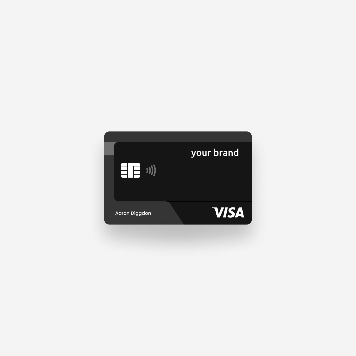
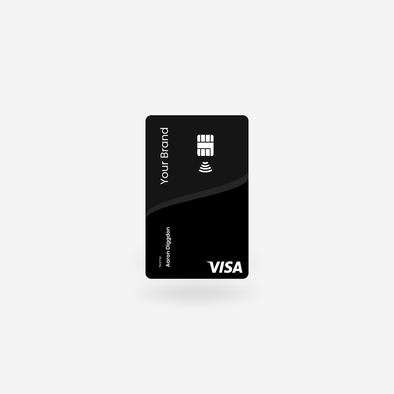
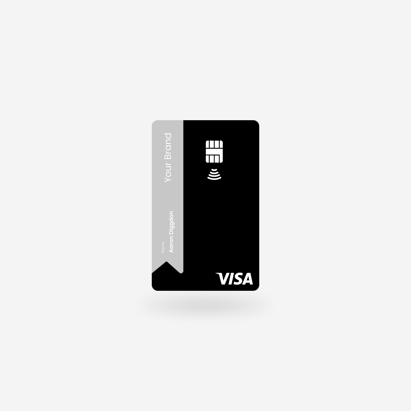
To use in it’s CCAS product, Railsr needed to create a credit card that was versatile enough to fit any brand, while providing the end-user with an elevated feel that would keep the card “top of wallet.” I was brought onto the project to iterate through options with our card vendor and Visa, and deliver card designs for physical production.
Role
Lead Product Designer
Date
Sep 2020 - Jan 2021
Task.
Iterate through options with our card vendor and Visa, and deliver card designs for physical production.
Discovery
To create a card that could compete against the most prominent names in credit card services, I conducted competitive research on cards like Apple, Amex, and others known for having an elevated feel or status. However, I found the most inspiration looking at smaller companies like Robinhood, who are pushing the boundaries with elements like transparency in their debit card.
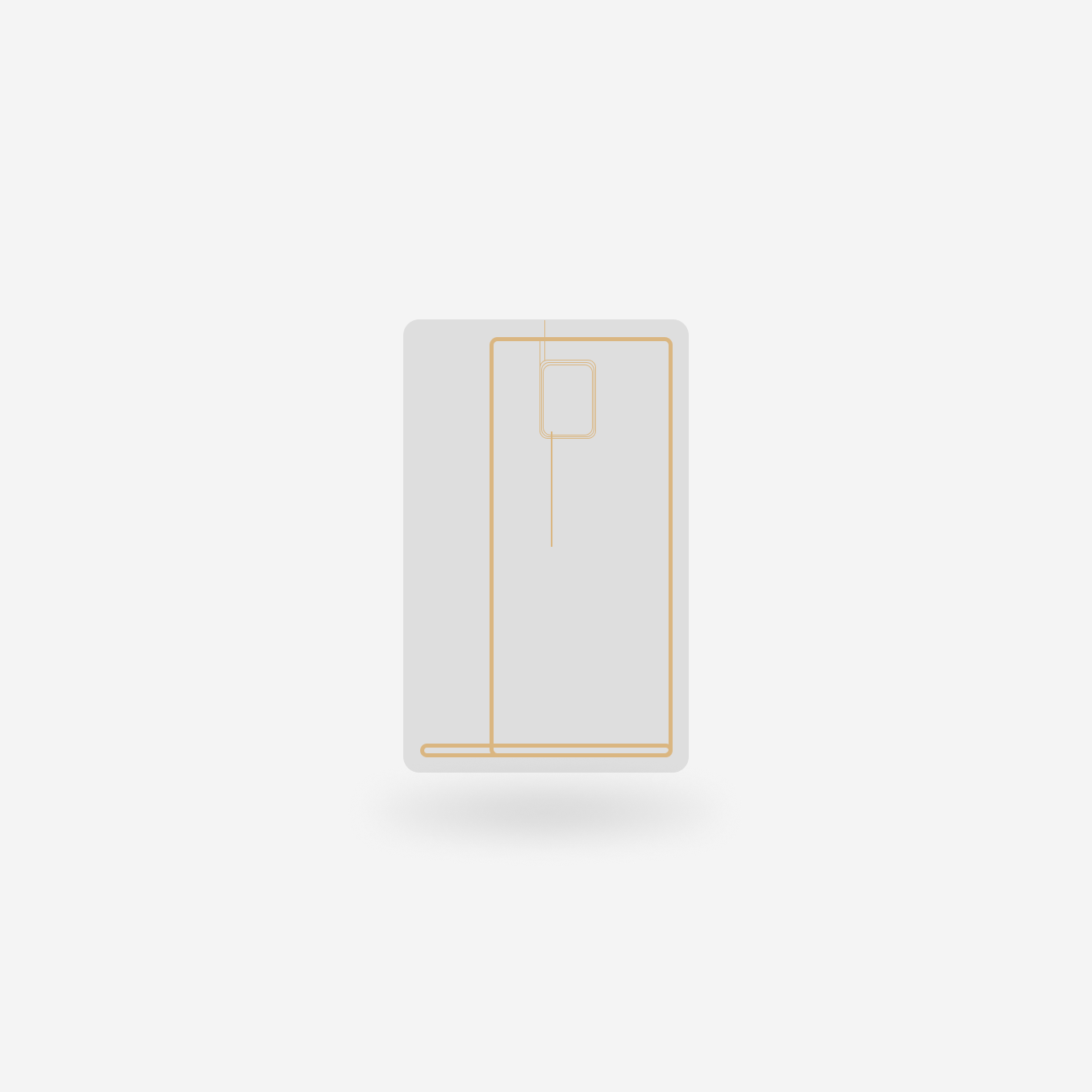
Deconstructing
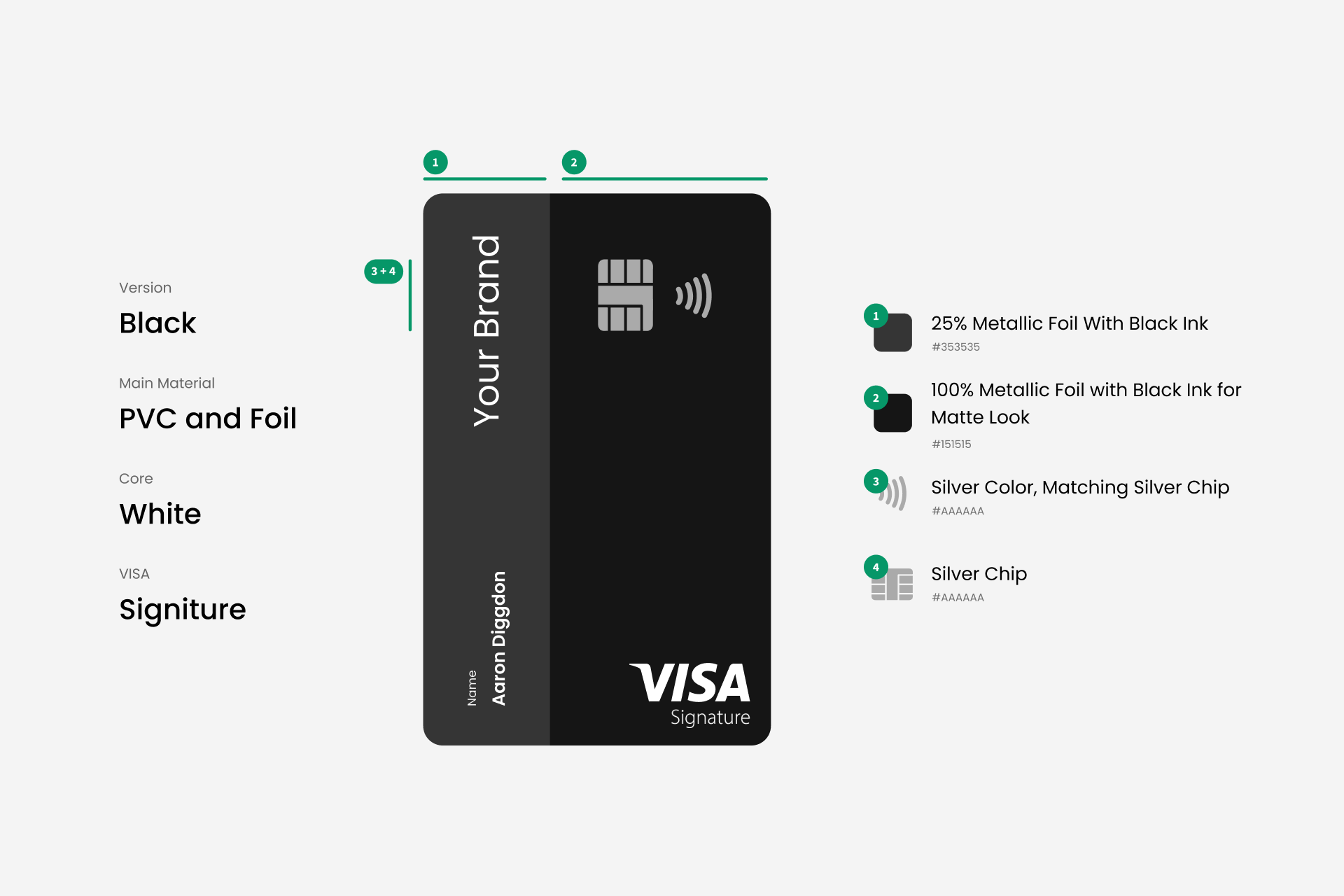
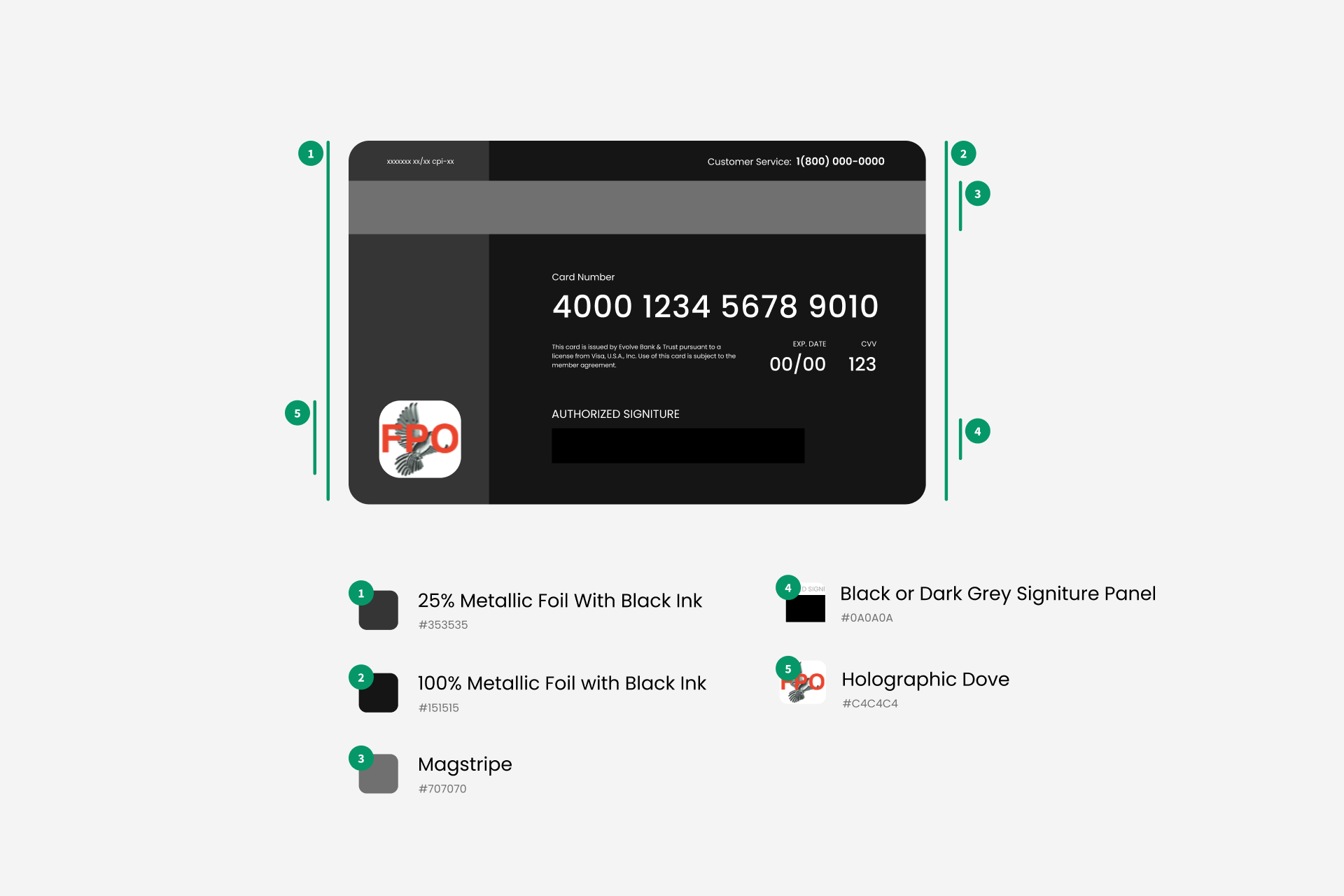
Working with Visa and our card vendor, I began to deconstruct the industry standard credit card, creating a list of essential, non-essential, and customizable elements. During meetings I regularly referenced the Apple Card, that’s known for its lack of content and minimalism on the physical card, as what I would hope to achieve.
Cardholder Name
/
Chip
/
Contactless Symbol
/
Security Code
/
Visa Signature Logo
/
Security Sticker
/
Cardholder Name / Chip / Contactless Symbol / Security Code / Visa Signature Logo / Security Sticker /
Interaction
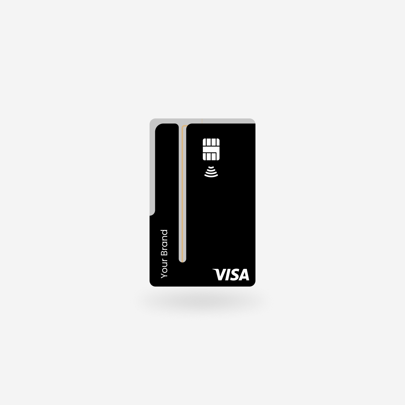
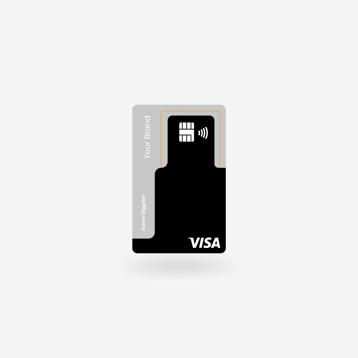
After understanding the constraints, I started to think about user-interaction with physical credit cards in the real world. I came up with three different states of a card to describe how users interact with them: Wallet, Contactless, and Chip.
I used these states as a reference when designing the card, so I could control what would be visible to the user at any given point in their experience.
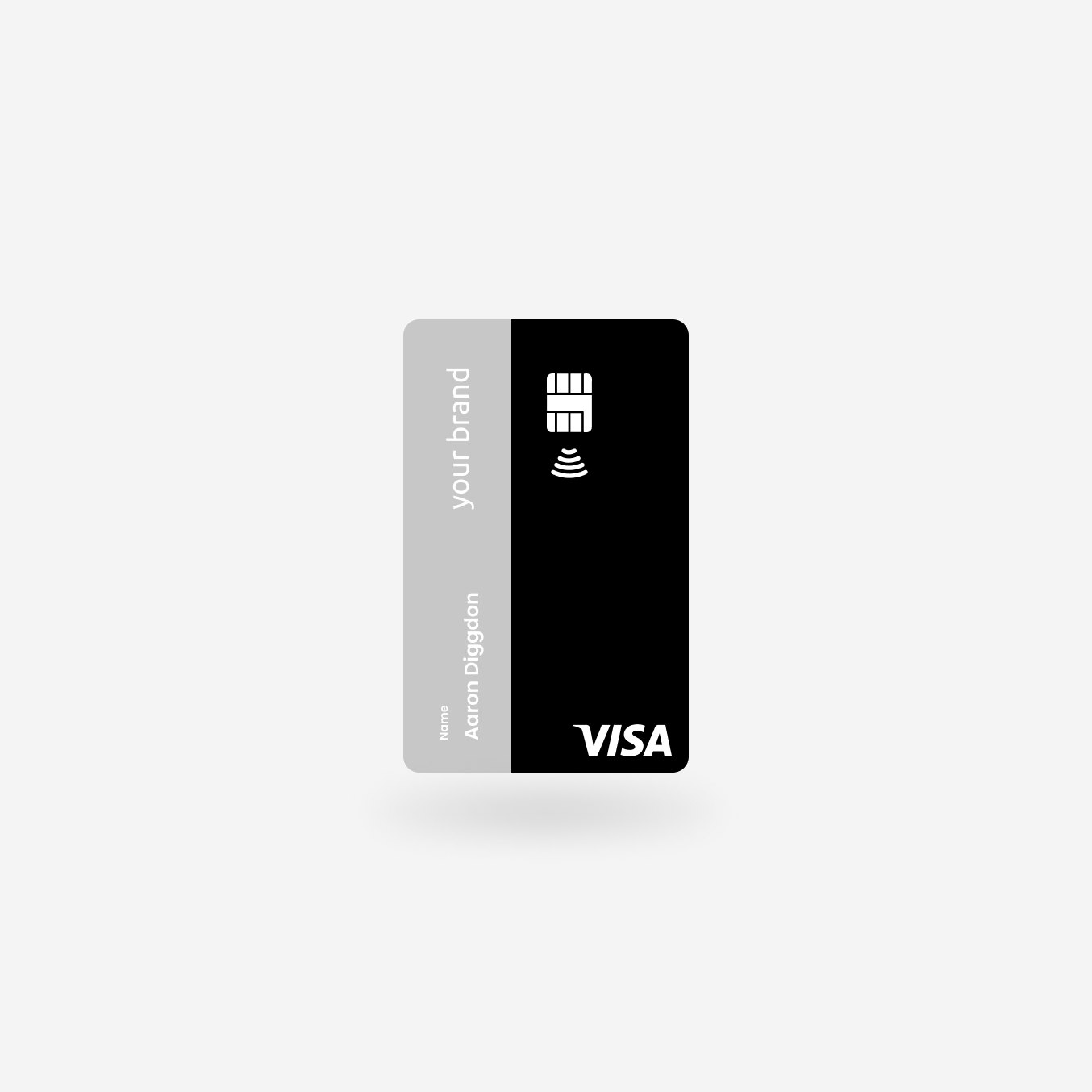
What was most important to our customers was having the brand’s name visible, so I worked with concepts that had the brand’s name at the top of the card during the Wallet state.
My personal objective
Design a card that was applicable to any brand and desirable to use, while elevating the experience for the user. I wanted to design a card that stands out from in a world of generic financial service cards.
How I Achieved This.
I strived for less, choosing to use a minimalist sans-serif font and used a black on black color scheme for an elevated feel.