Money 2020
Led Campaign Creative Direction and Rebrand

Overview
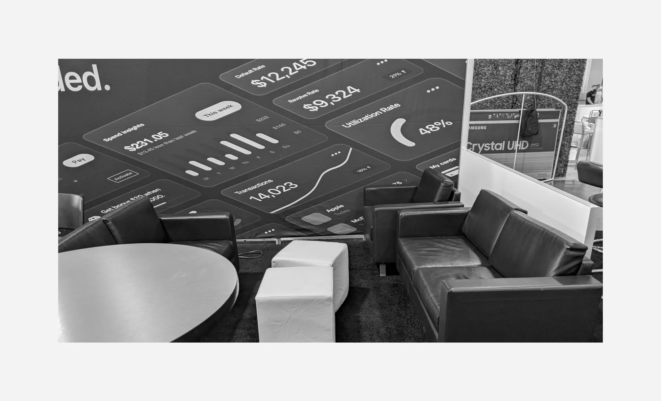
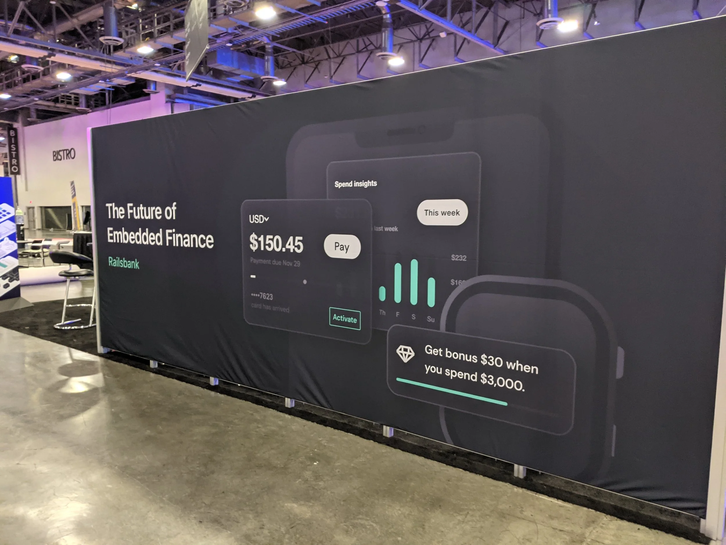
Designed and directed a visual campaign for Railsr’s Money2020 conference presence - guiding the company through a major rebrand, and producing foundational assets for current and future marketing.
Key Contributions
Led design end-to-end, owning outreach with vendors, aligning needs between stakeholders, and unifying brand identity across digital, print, and event channels.

Defined Brand Positioning
Collaborating on category design research to clarify market-fit and unique product offerings.

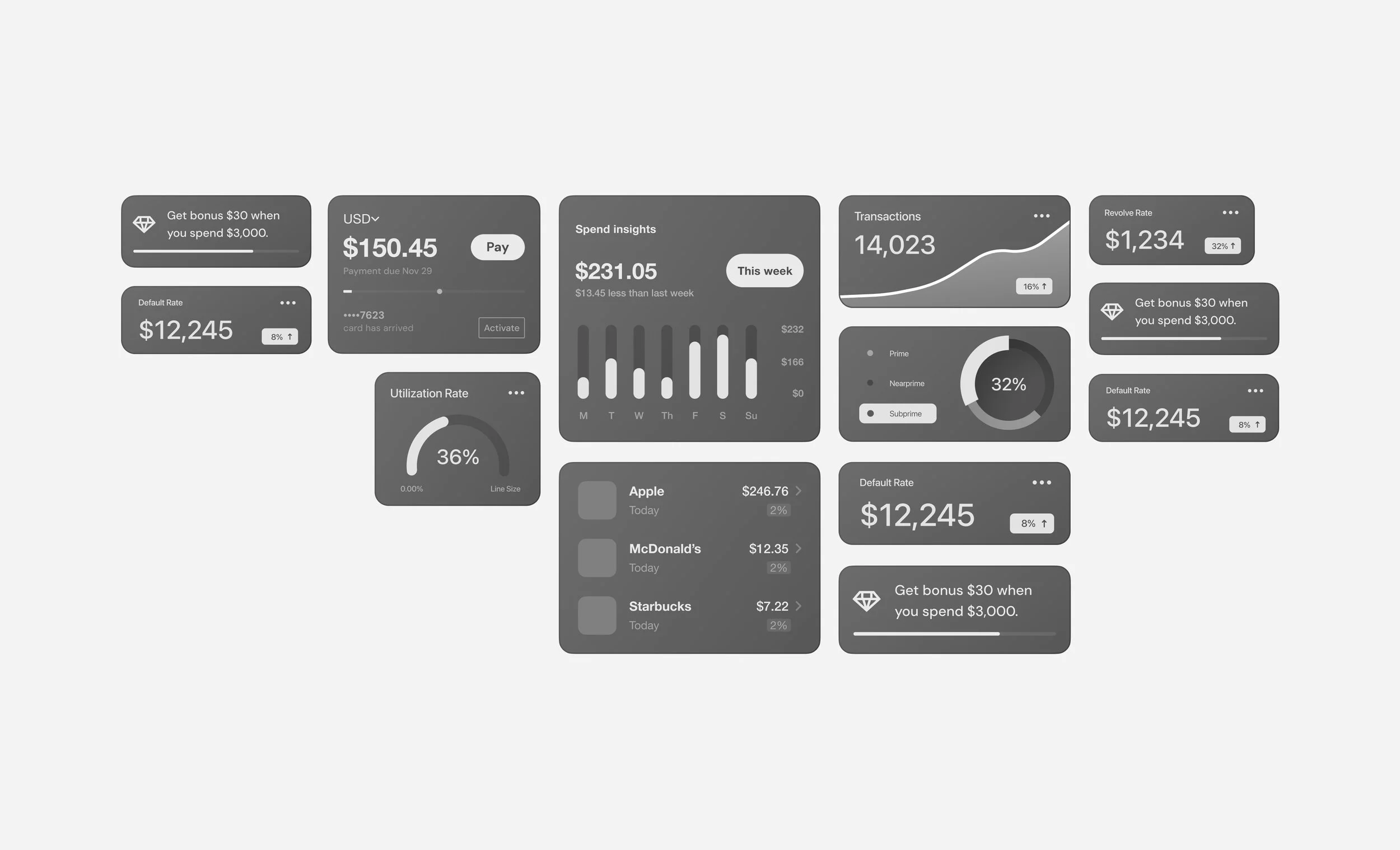
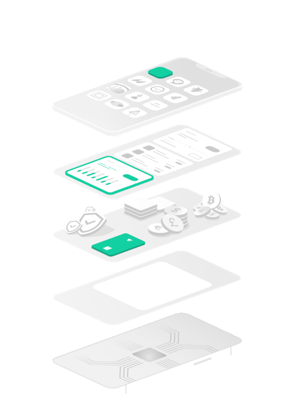
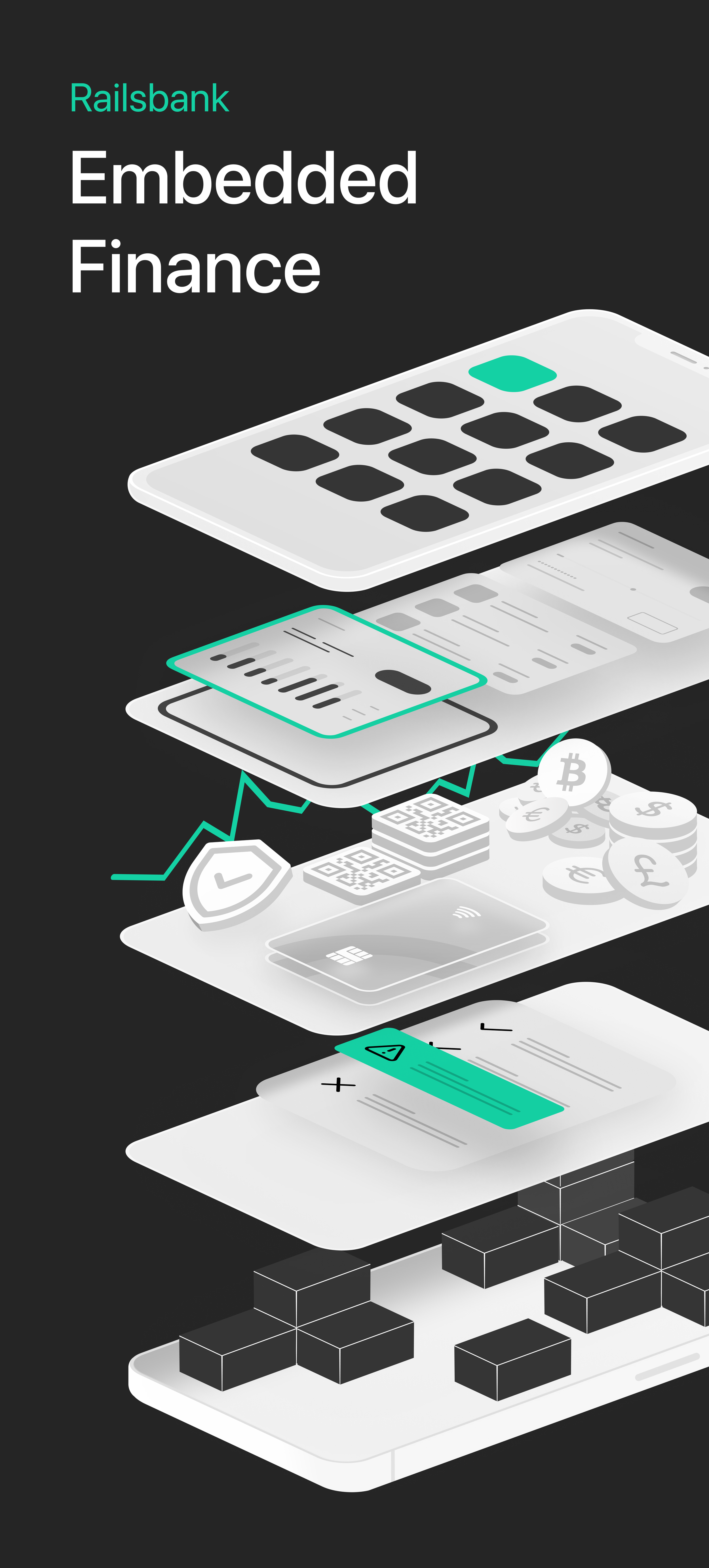
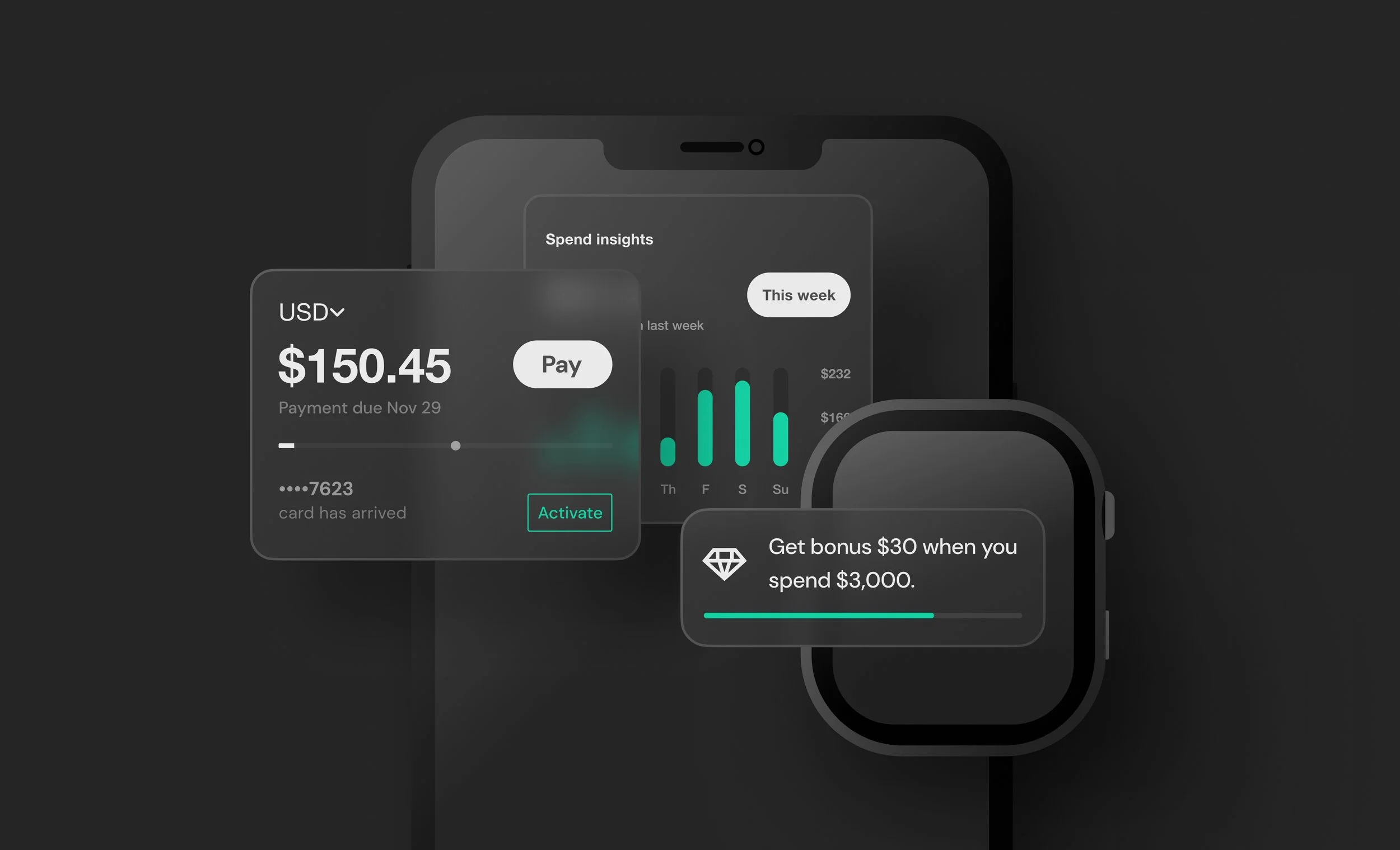
Visualized Product Offering
Created a visual “blueprint” that clarified Railsr’s value proposition for clients and partners.

Led Design of Campaign Assets
Designed assets and ensured consistency across mediums, delivering on a tight timeline.
Outcome
Positioned Railsr as a pioneer in Embedded Finance, driving 10+ sales leads and elevating brand credibility.


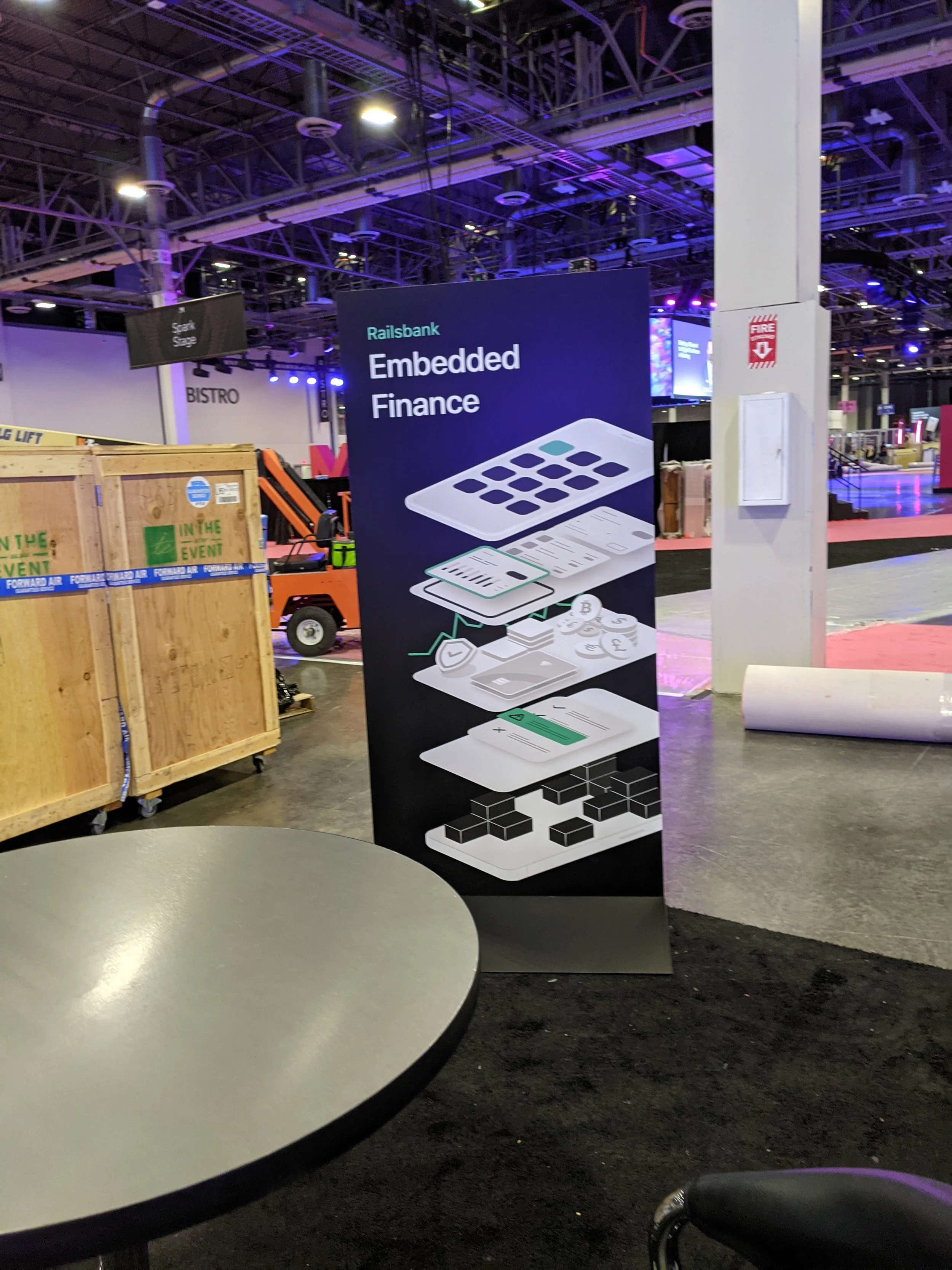
Design Brief
Drive leads through a multi-channel rebrand & campaign
—
including booth graphics, event marketing visuals, and merch.

The Challenge
Railsbank was midway through a rebrand led by an external agency with Money2020 approaching. With no insight into upcoming brand changes, I was called in to innovate on branding and visualize our product offering to drive sales leads.

We needed to define Railsbank’s value proposition to make the product offering memorable, no matter what the final branding would become.

This uncertainty gave me free rein to push beyond old conventions and lead a bold creative rebrand for the campaign.

Navigating ambiguity meant working closely with stakeholders to translate complex product layers into a clear, visual story.
Strategic Foundation
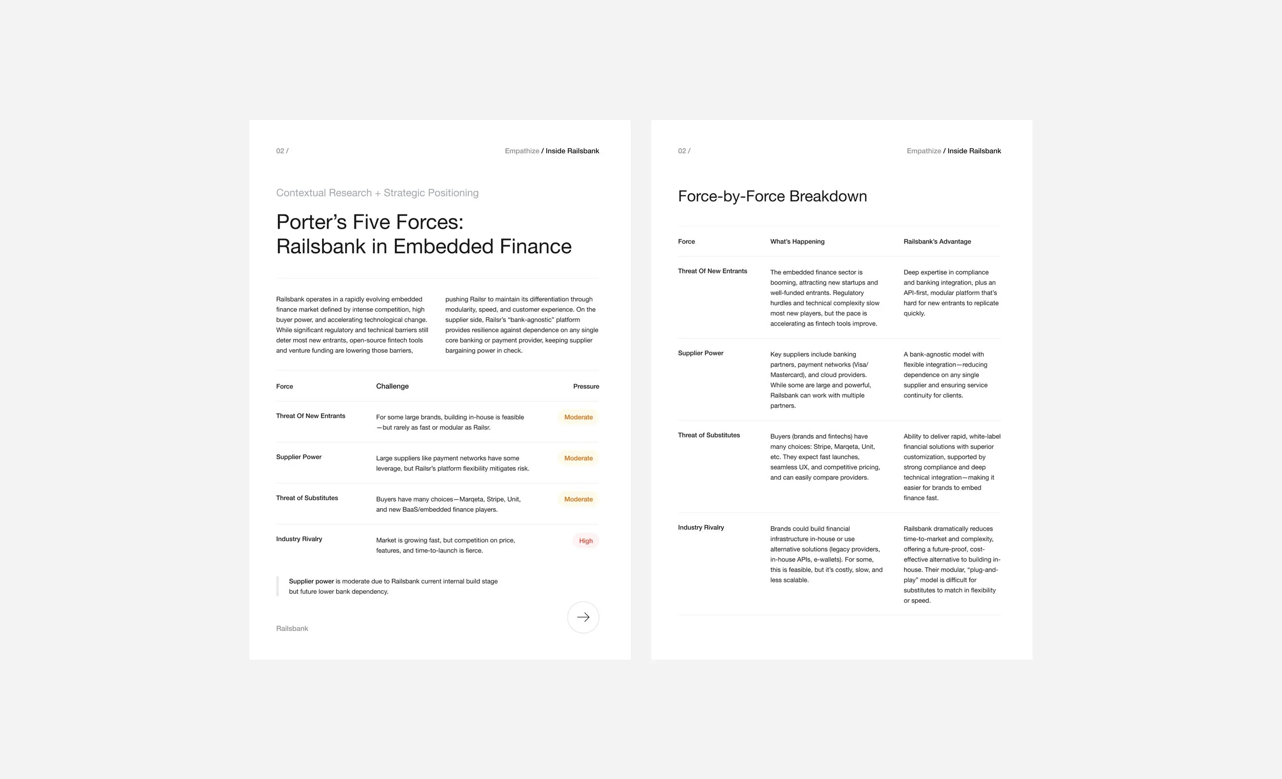
Discovery & Category Design Research


-
Railsr is the one-stop shop for embedded finance — offering a suite of turnkey financial products plus the full operational backbone (digital transaction ledger, legal compliance, banking partnerships) to launch them fast.
-
Railsr combines embeddable, pre-designed financial components with the behind-the-scenes infrastructure to run them, enabling brands to launch fully-branded financial experiences in record time.
-
Railsr serves digital-first brands, fintech startups, crypto projects, and large enterprises looking to embed financial services without building banking infrastructure themselves. Drivers: boost engagement, brand loyalty, etc.

Category Design Research
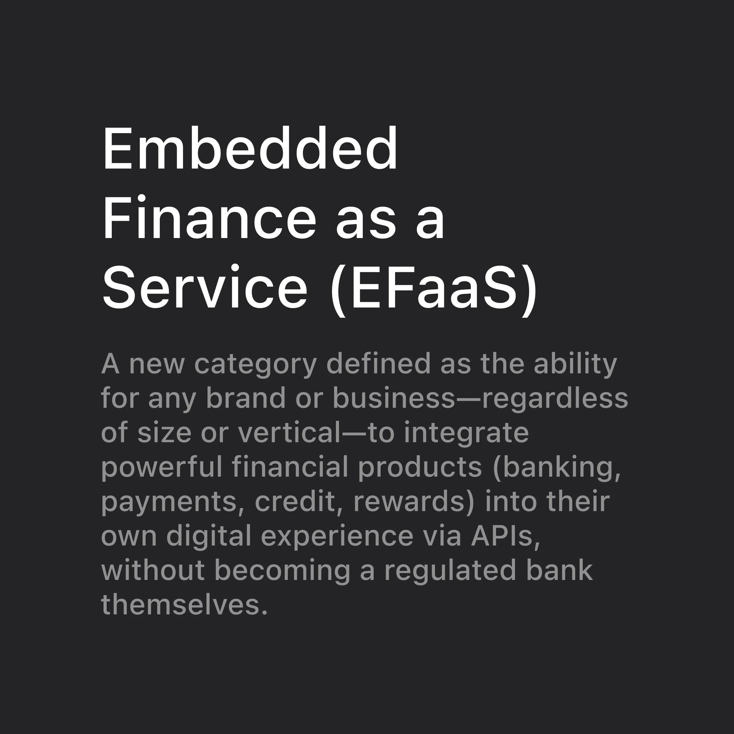
We started by defining Railsr’s position in the fast-growing embedded finance market—distilling a bold category identity centered on “Embedded Finance as a Service.”
Facilitated stakeholder interviews
Uncovering Railsr’s embedded‑API strengths and modular BaaS/CaaS positioning.
Conducted SWOT mapping
of competitors to find strengths and weaknesses in our own product offerings and differentiation.
Defined Messaging Pillars
— Modular components
— White-label brand adaptability
— Speed of integration