Designing a Branded Sales Deck for Railsr
Overview
After a rebrand, I designed a new deck template and applied branding principles that elevated the visual identity of Railsr.
My Roles
01 / Visual Designer
02 / Presentation Designer
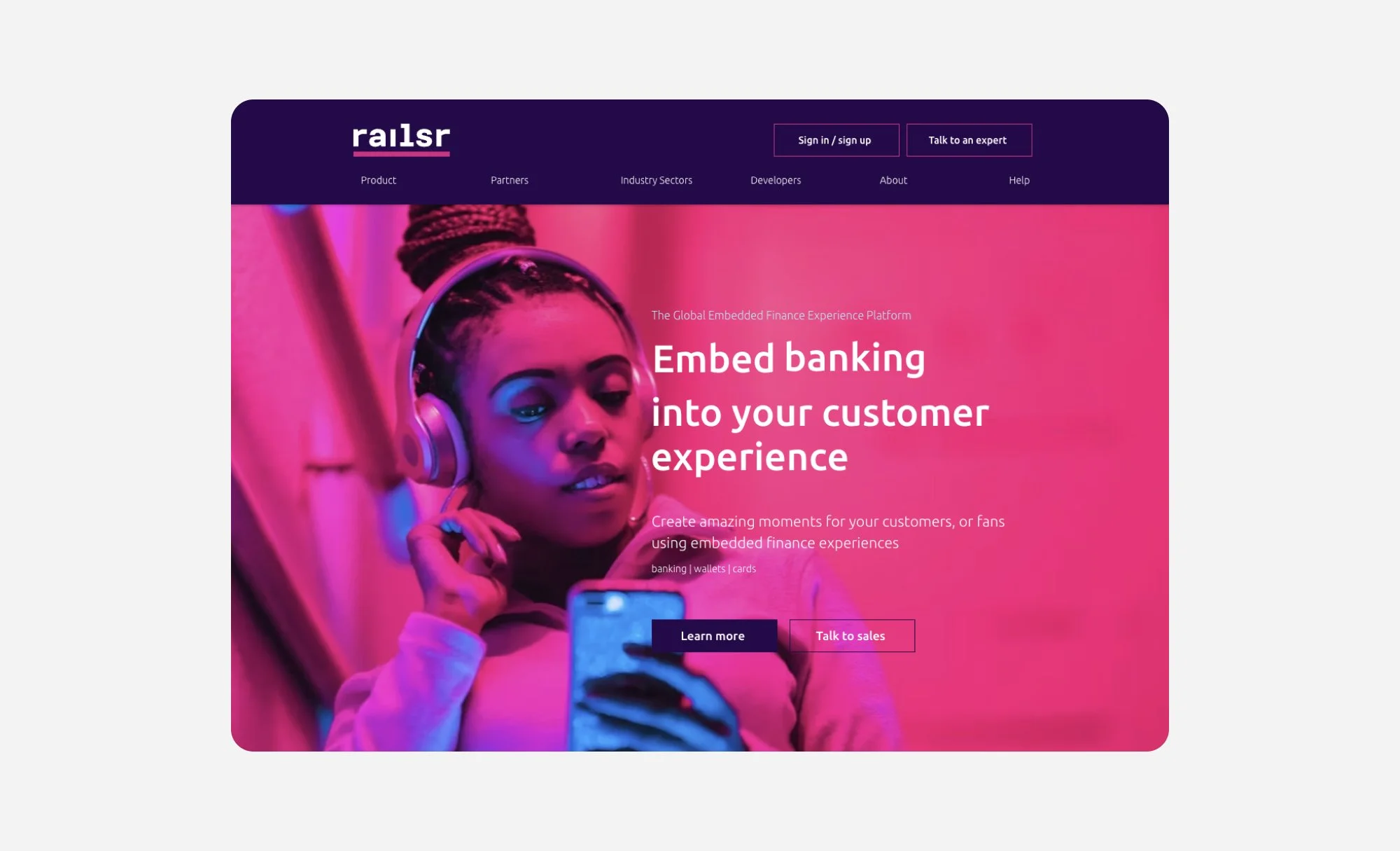
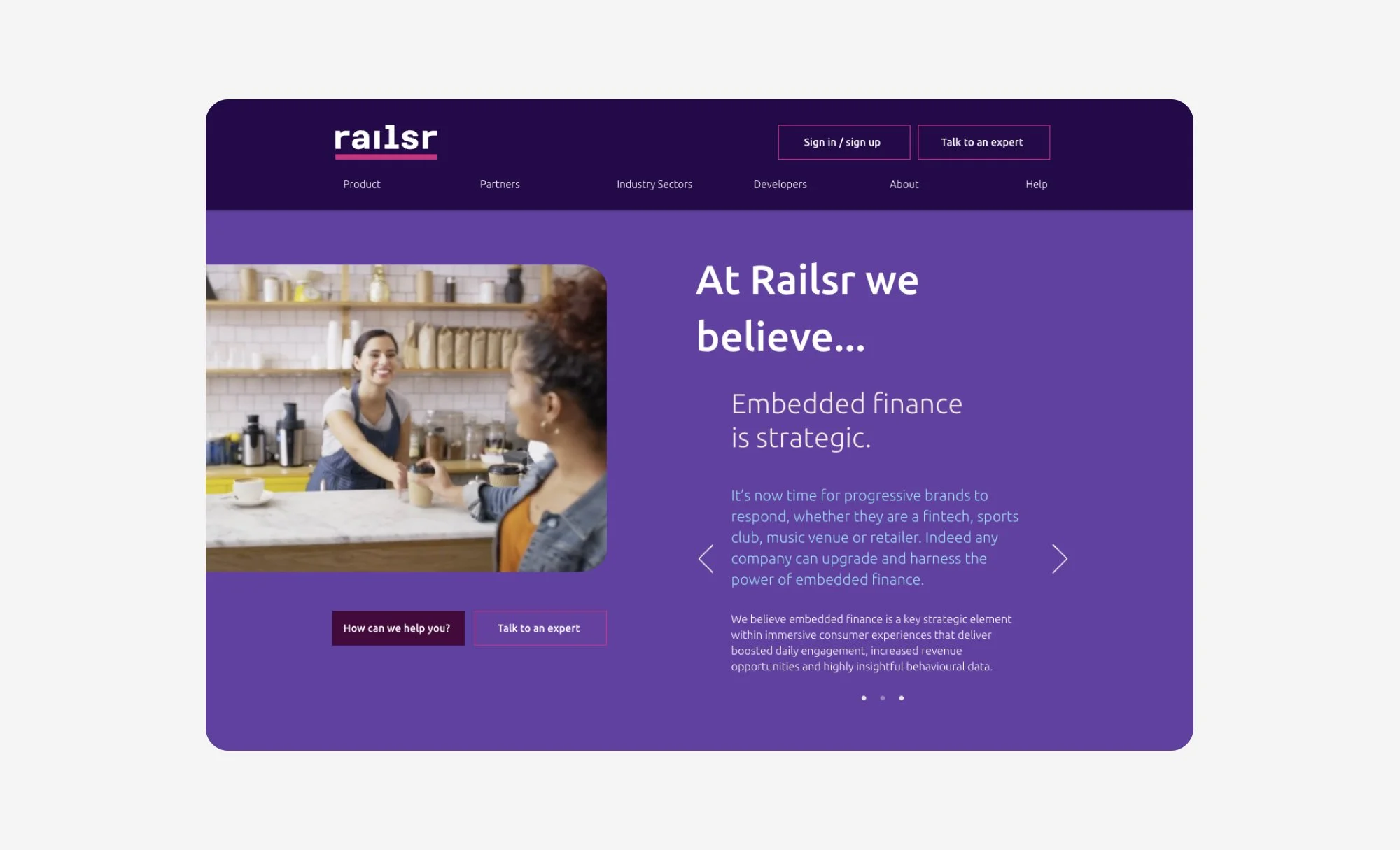
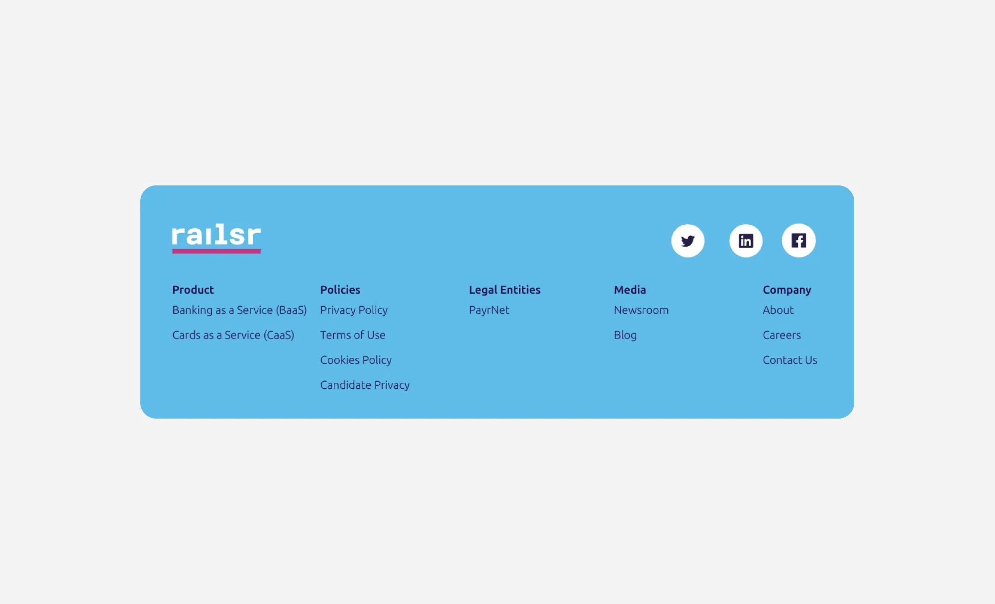
Before
There were no official brand guidelines, just a series of colors and mood board images with recommended fonts.


Process
Deconstructing existing elements, and recreating applying them in Figma.
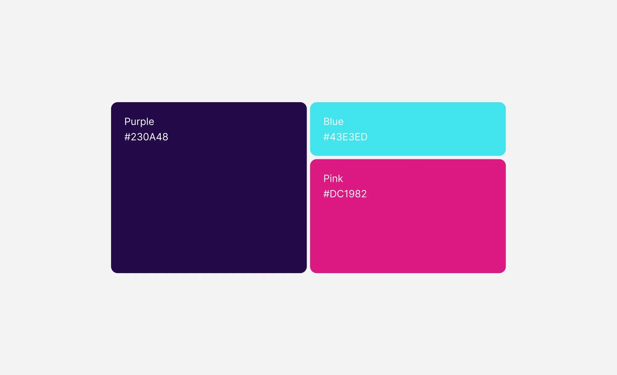
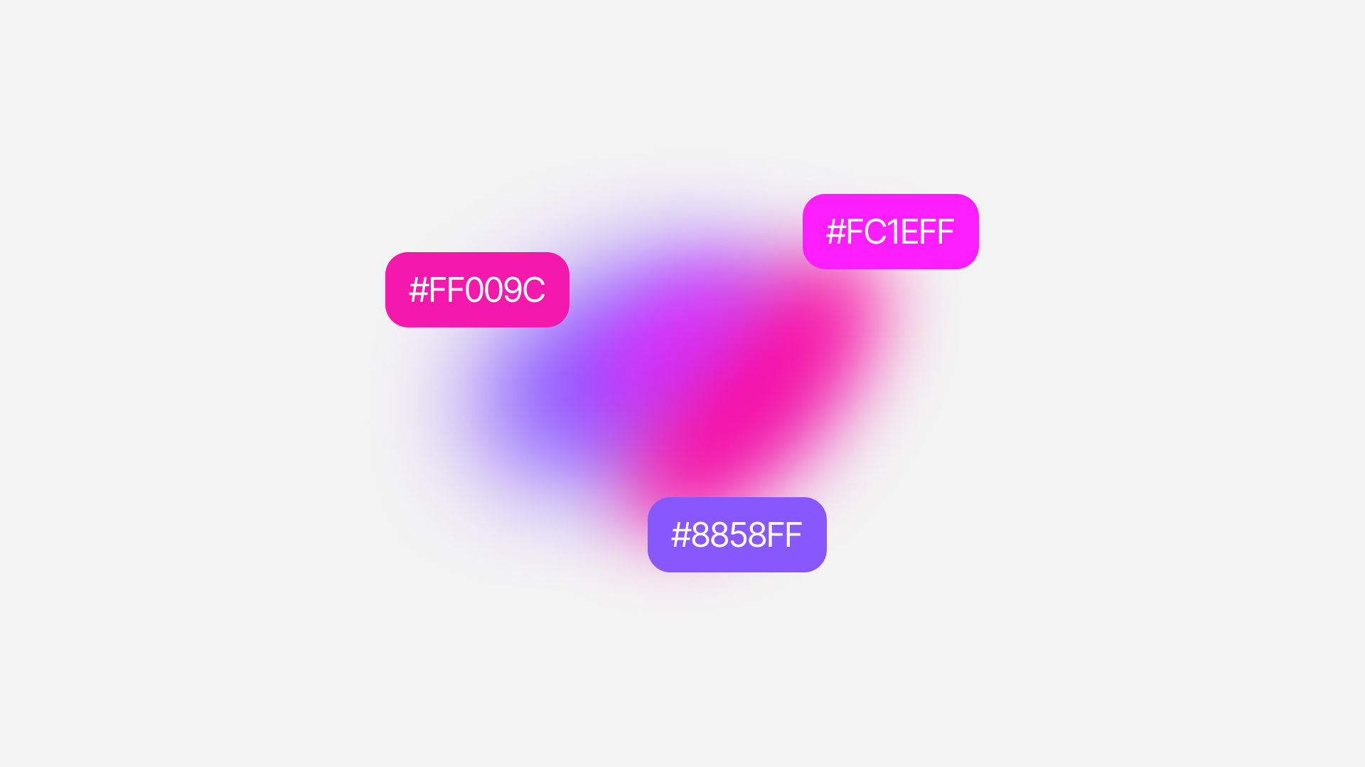
Colors and Gradients
I pulled key colors and gradients from existing elements like the website and mood-board images.

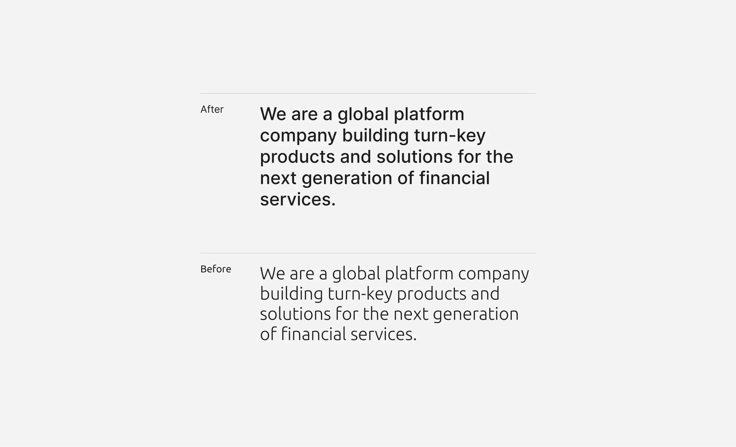
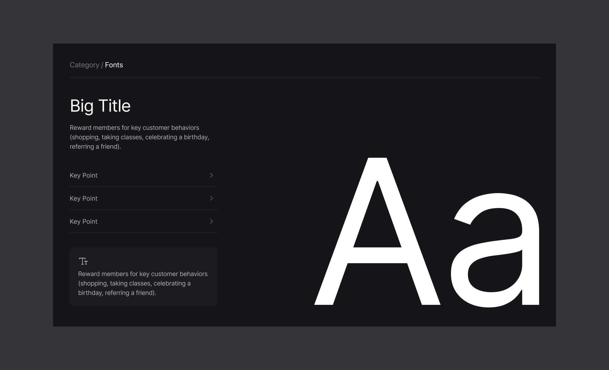
Assessing font legibility, the chosen font type, “Ubuntu” was hard to read on the backdrop of images.
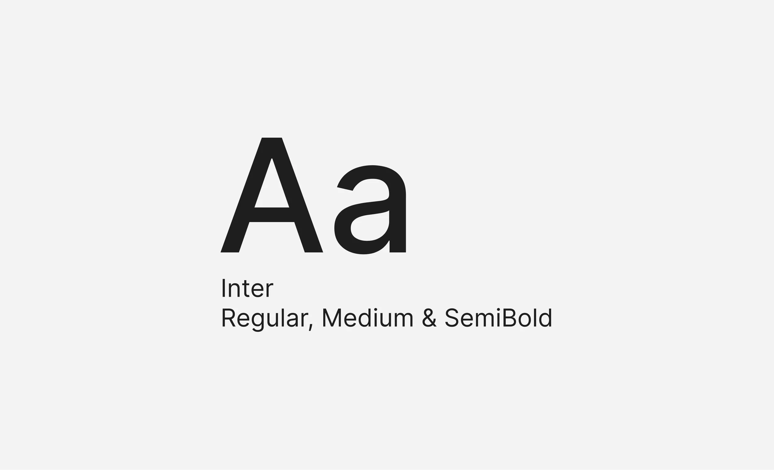
Font Styling
Component Styling
Sharp edges of buttons, thin lines, and lots of color.

After
I created a variety of reusable visual assets and deck slides.

Design Decisions
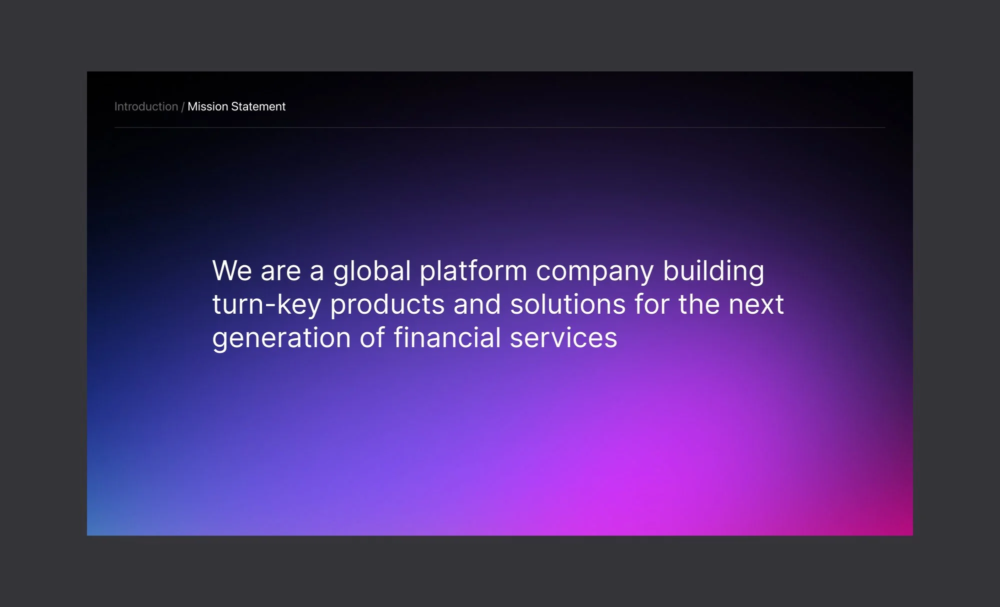
I created visualized our key product offering, updated accessibility standards, and refreshed the visual identity.
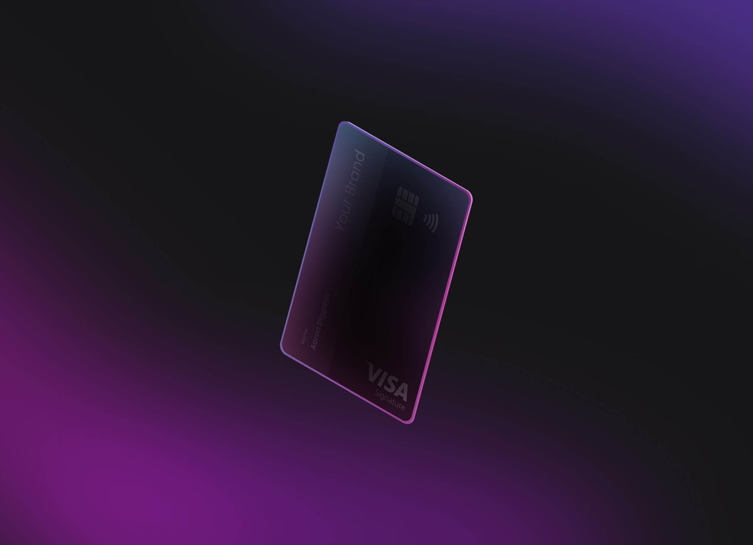
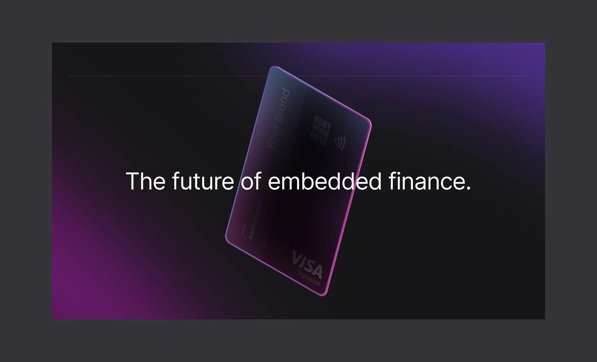
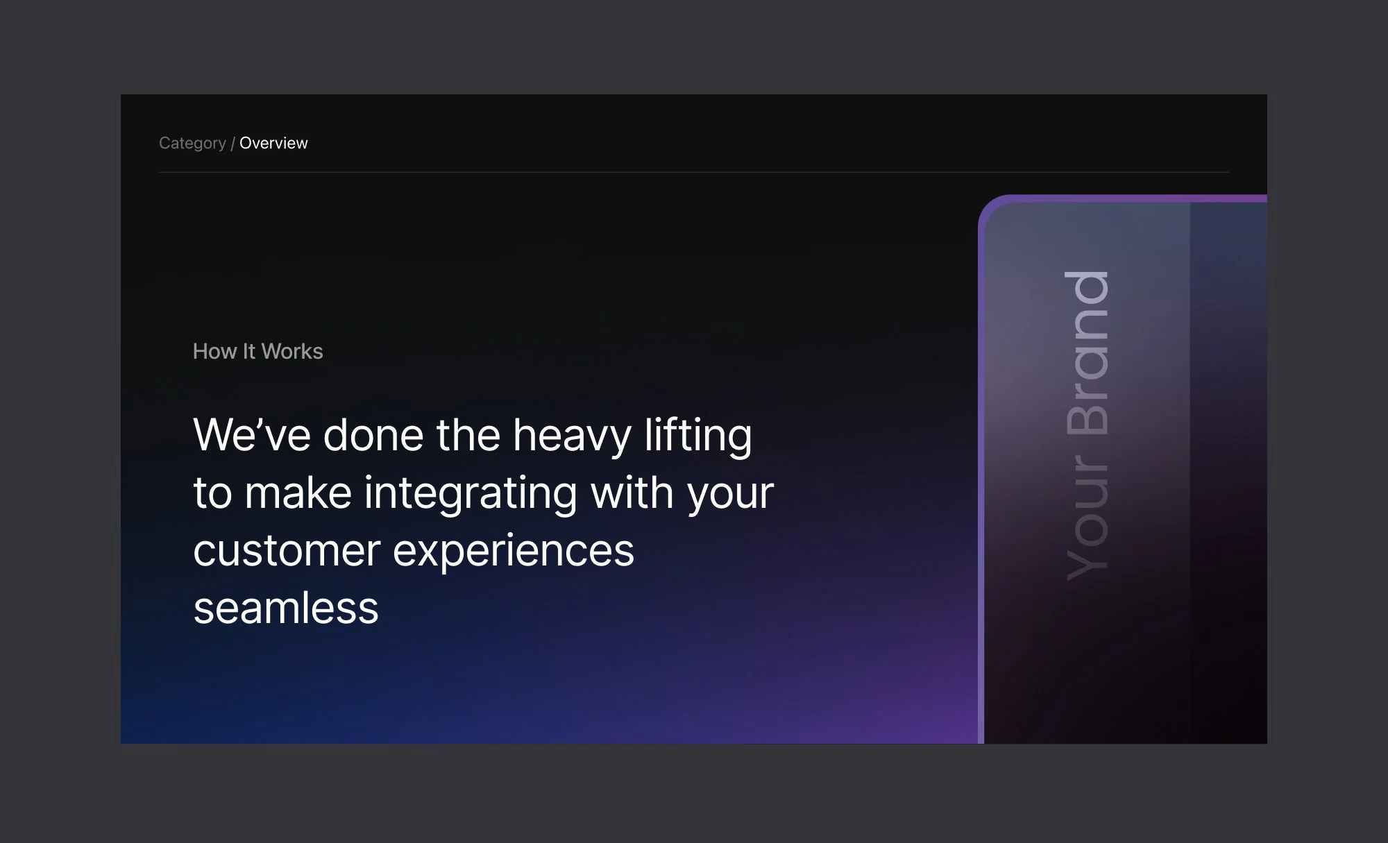
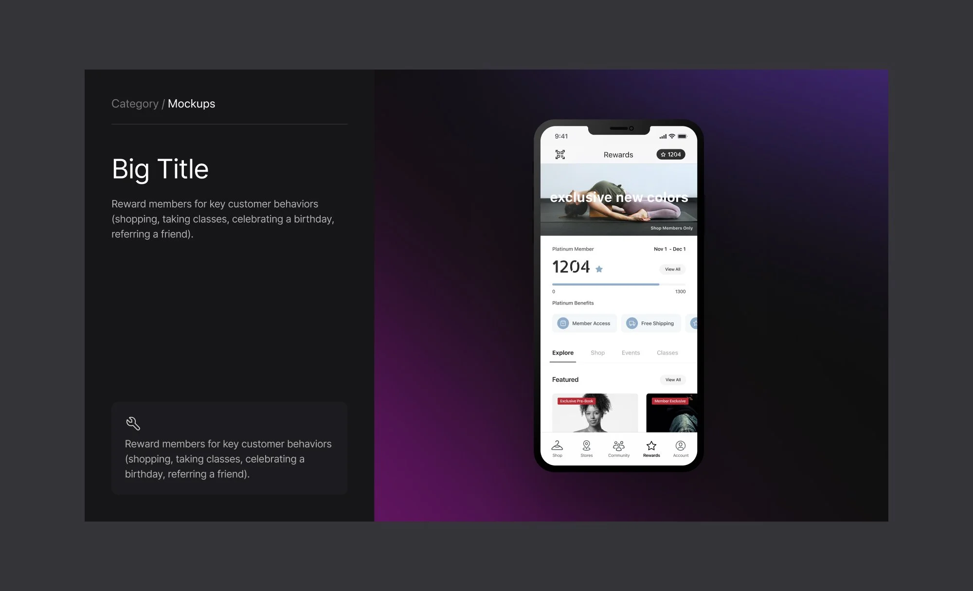
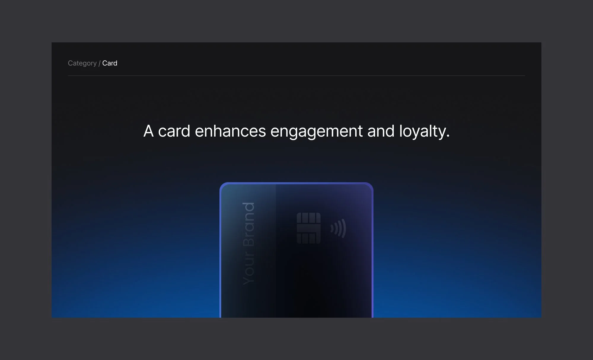
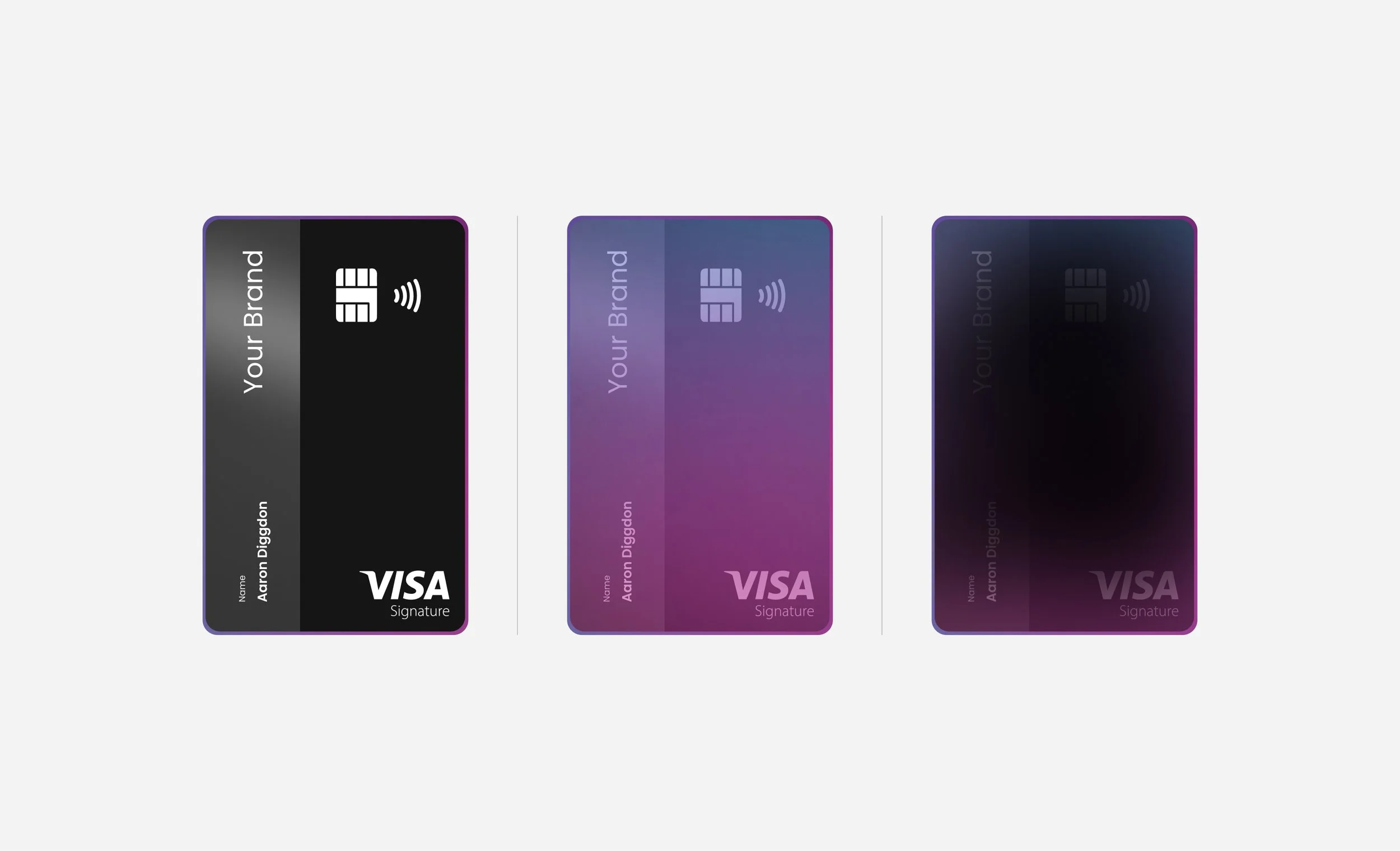
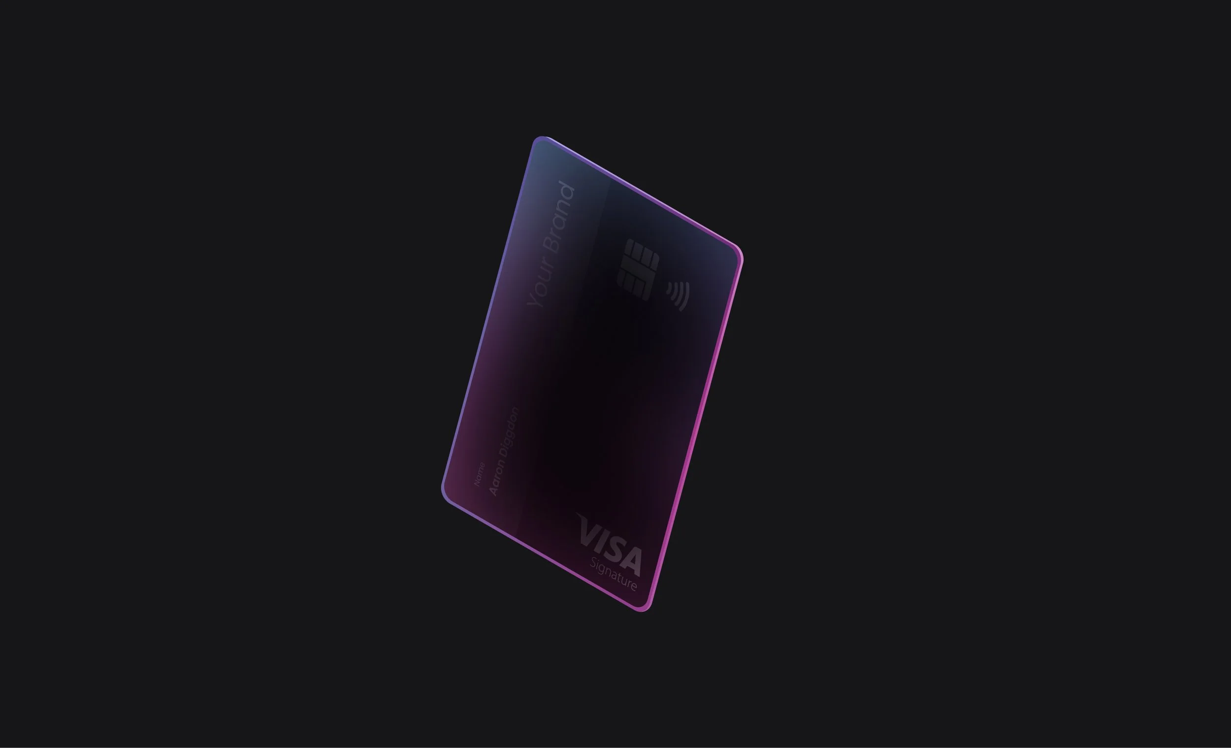
Using our CCAS card designs (which I also designed) I was able to overlay gradients to create a back-lit card visual. This blended our our key product offering with the new branding.
Credit Card Visual
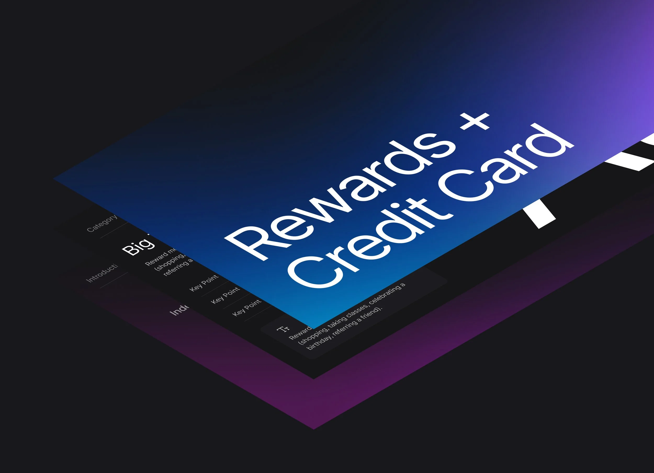
The gradients were overstimulating when used together on colored backgrounds, so instead I used used selectively to draw attention and build suspense with a dark background.
Dark Theme
The previous font raised accessibility concerns when used in dense text, so I reserved it for decorative styling instead of body text. I chose a simple Sans Serif to minimize complexity, and draw attention to selective uses of color.
Font Choice