Designed SDKs and Transaction Flows for Railsr
Overview
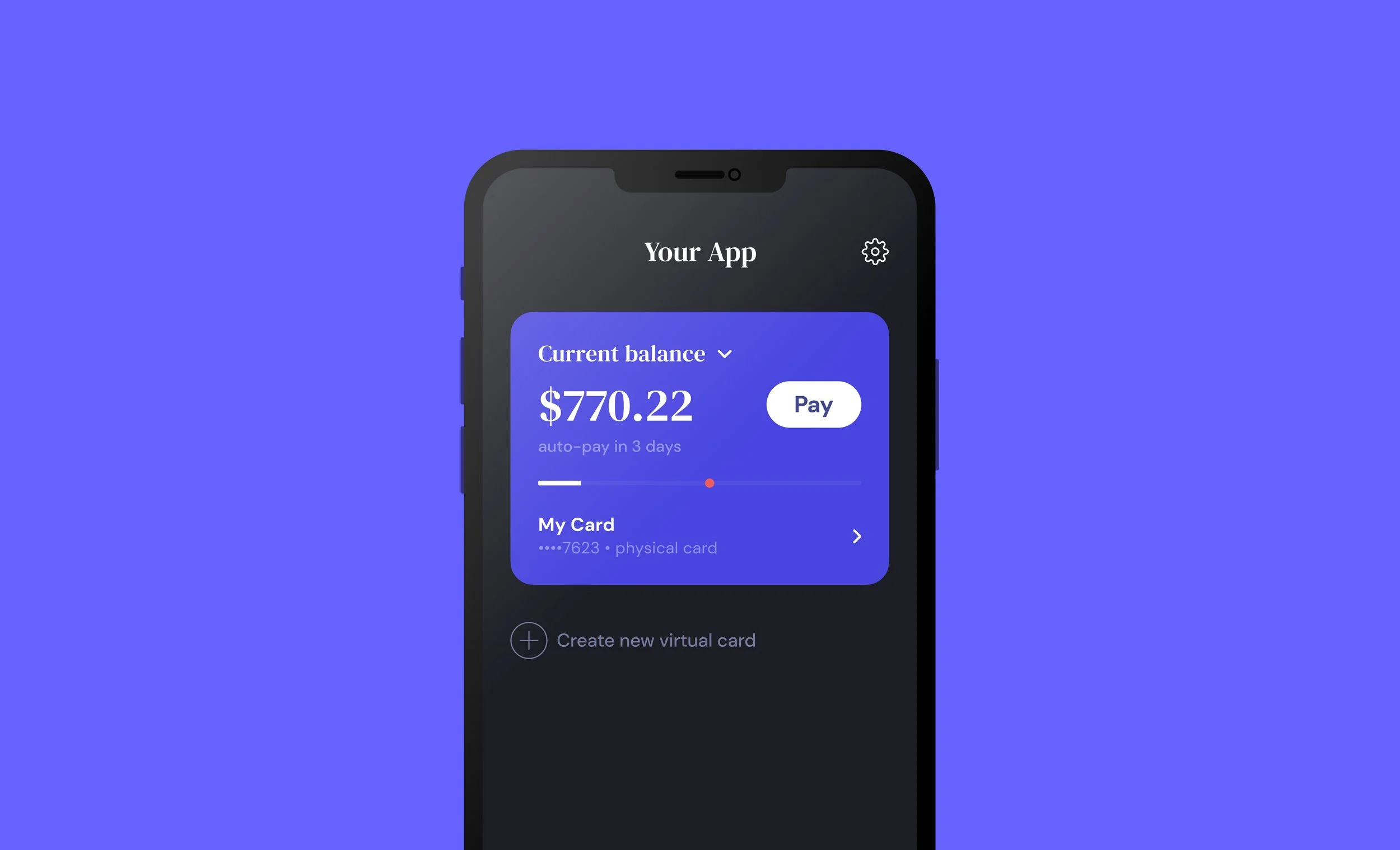
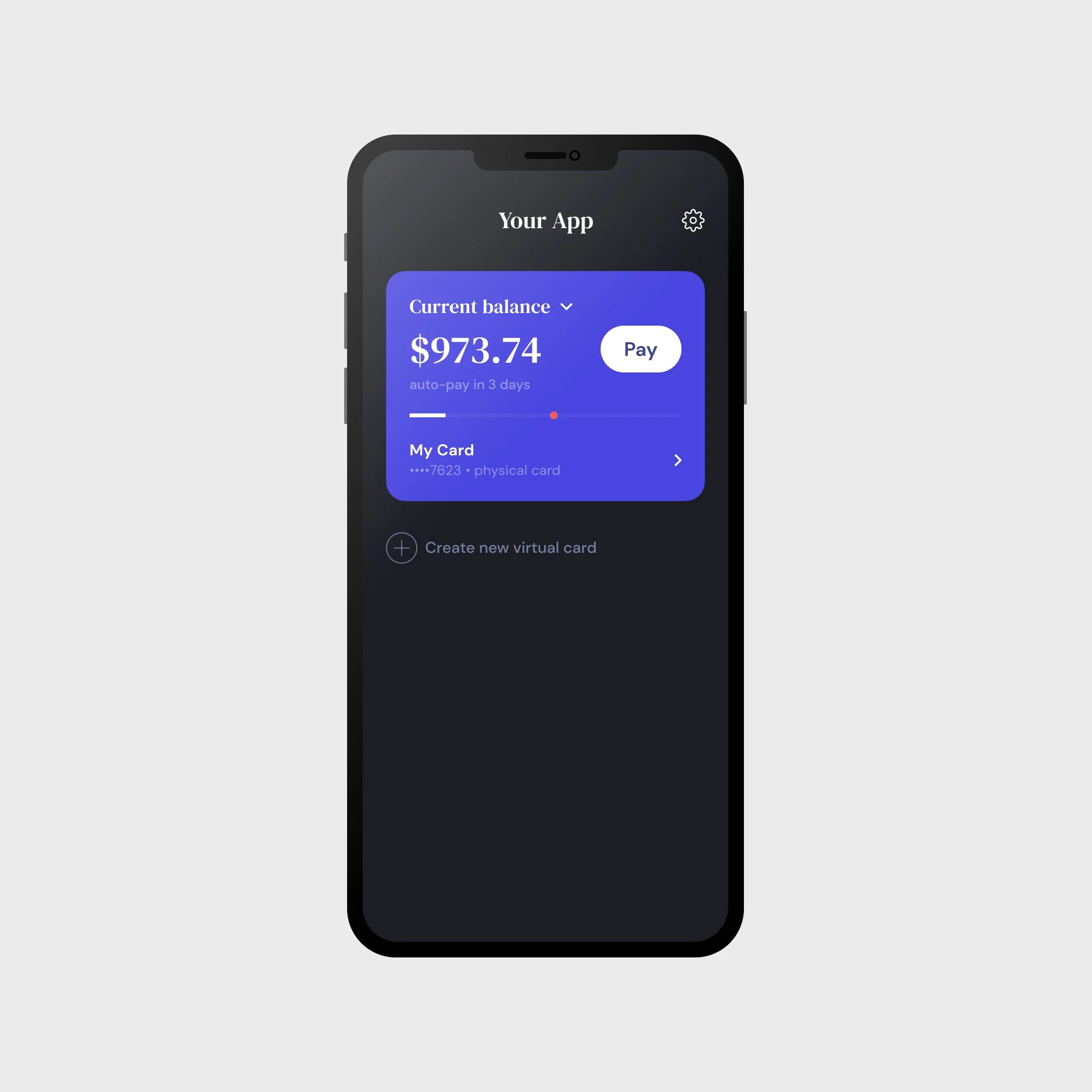
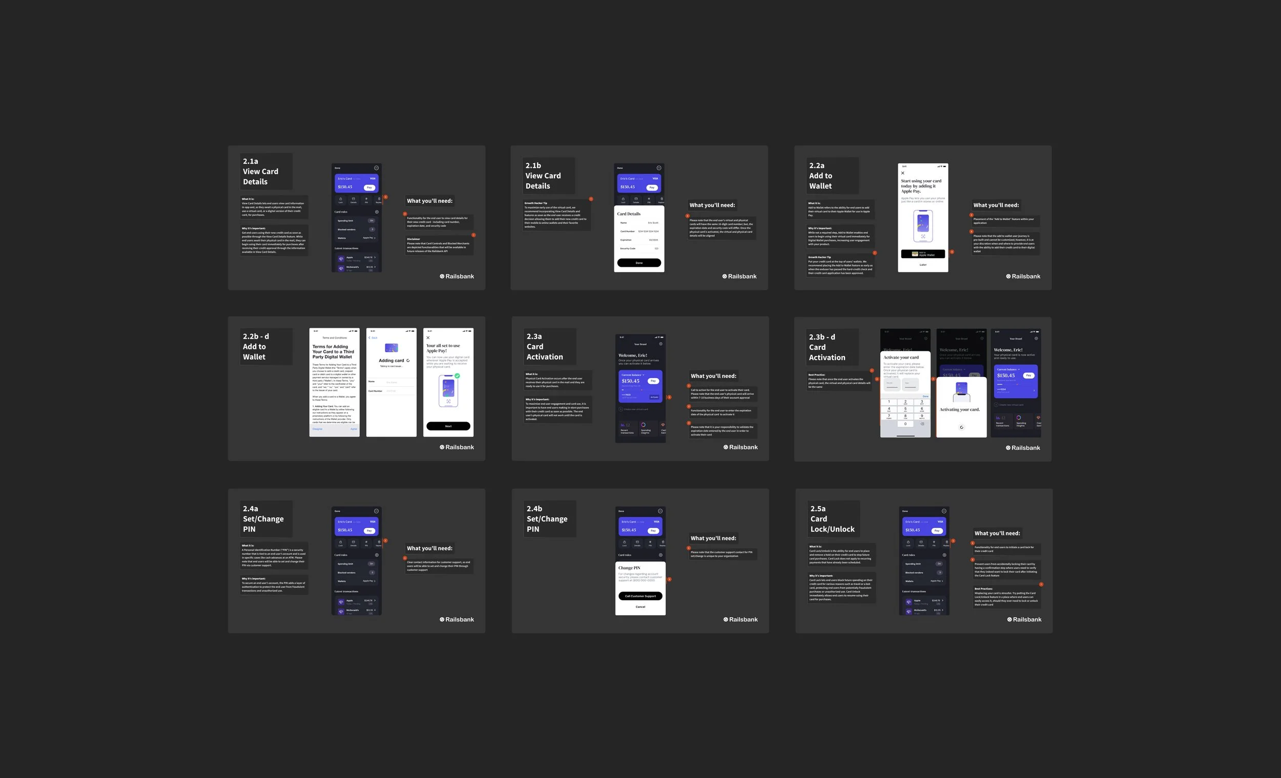
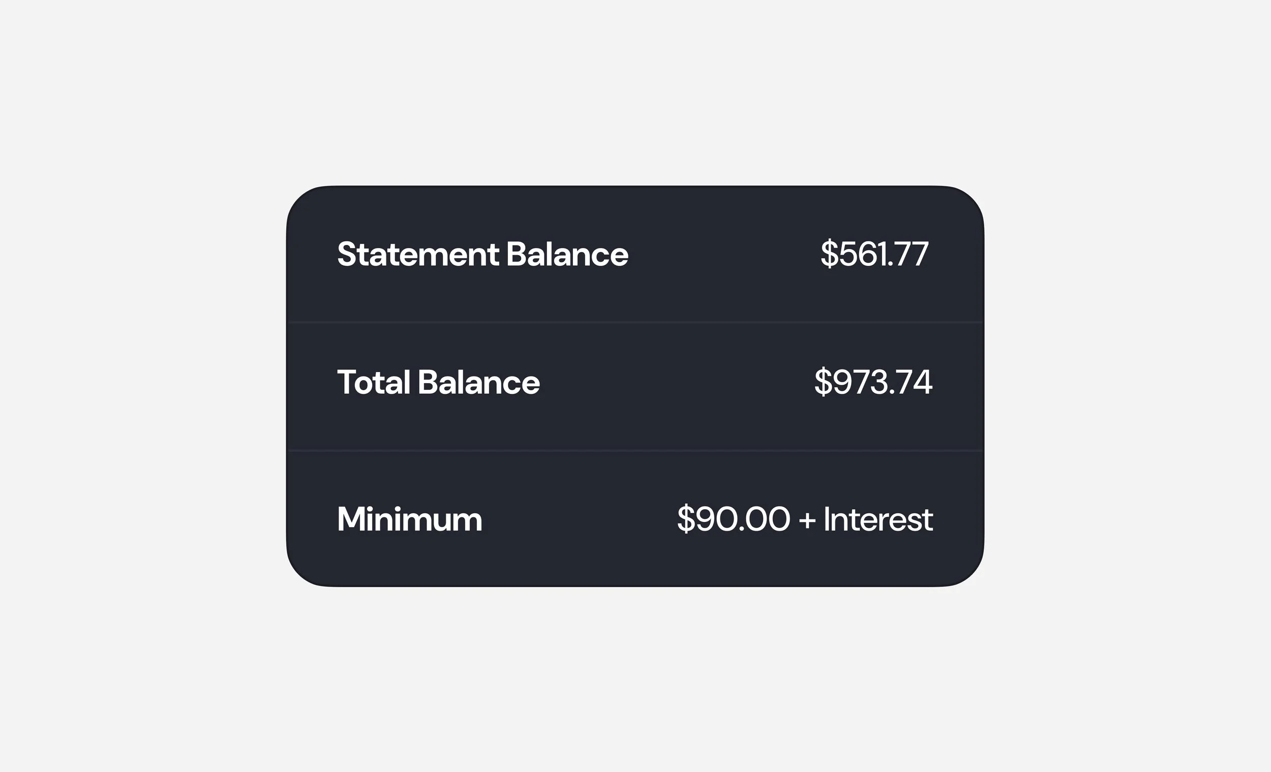
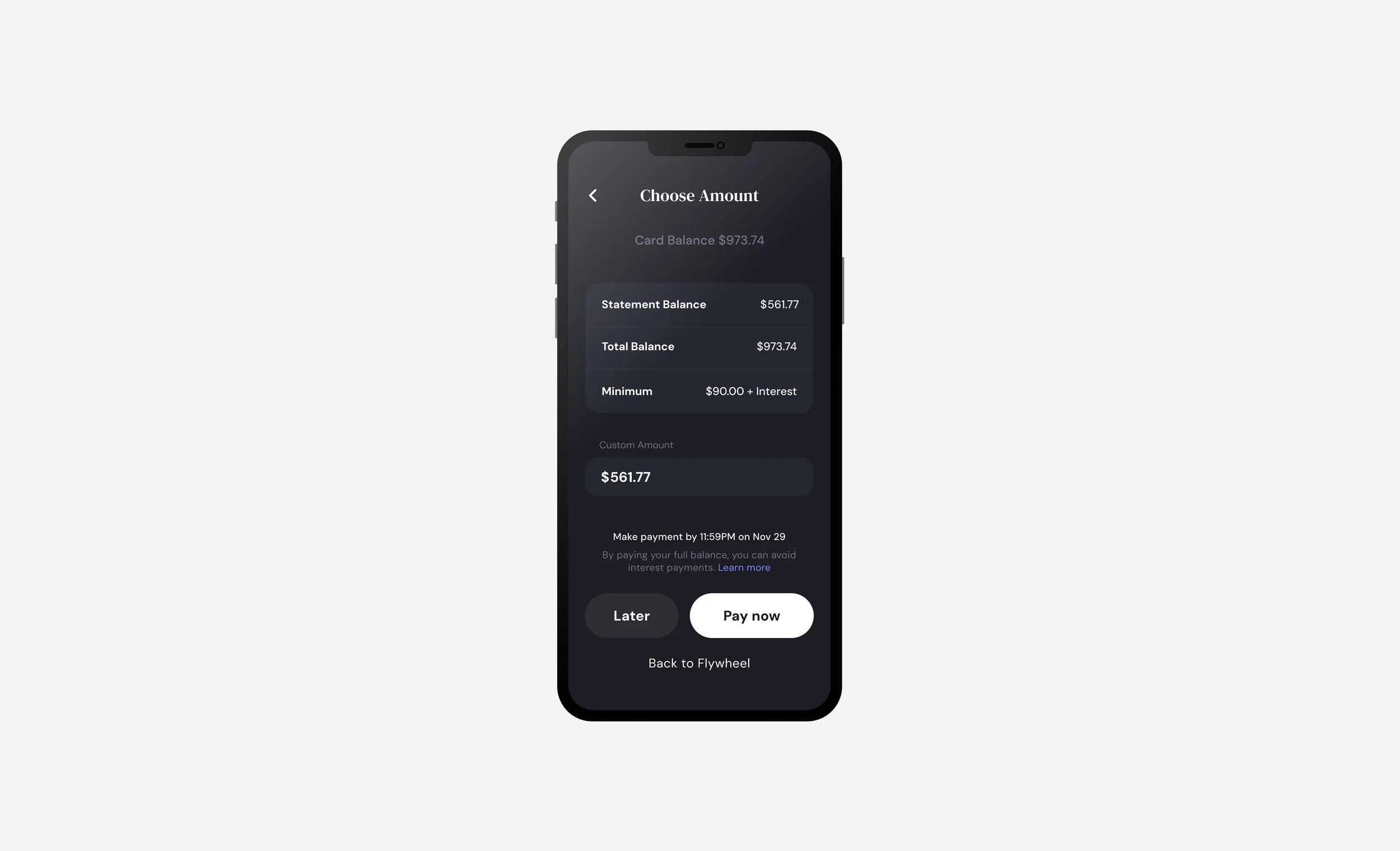
Designed ‘Make a Payment’ transaction flows for Railsr’s Credit Card as a Service (CCaaS) SDK design system. This enabled users to make and manage credit card payments using pre-built, brand-adaptable screens.
My Roles
01 / UI Designer
02 / UX Researcher
I delivered end-to-end UX flows, contributing to Railsr’s CCAS design system, and growing its usage to +60% of 220 B2B clients — servicing up to 5.5 million end-users globally.
Key Contributions
Conducted
User interviews and competitor analysis research.

Collaborated
Cross-functionally between Legal and Development teams.
Delivered
Mobile UX flows for SDK development in Figma.
Outcome
Grew design kit adoption to +60% of 220 B2B clients — servicing up to 5.5 million end-users globally.
My Process
Starting with UX and competitive analysis research, I mapped existing payment flows to see define requirements and journey-mapped to design a solution for our users.
Constraints
As part of a broader design system, I was limited by existing visual design guidelines and prompted to reuse components whenever possible. Tight budget and timeline limited user testing.
User Interviews
As part of a broader research effort, I contributed targeted questions and synthesized findings to understand user pain-points with traditional credit card payment flows.
User’s Primary Providers
Chase, Amex, Capitol One, and Apple Card
Pain Points with Providers
Confusion over payment options, too many steps, and information overload.
Users Want
Experiences that are fast, feel simple, and aligned with their financial well-being.
Competitive Analysis
I targeted competitors mentioned in interviews to empathize with user feedback.
I mapped their user journeys, and deconstructed screens by their atomic elements.
I used this list to define a PRD (Product Requirements Document) with legal and product teams.
With requirements defined, I could think creatively about how to redesign the user journey.
User Journeys
My research concluded that users often use the same “one-time payment” flow for two separate actions.
To reduce redundant information, I broke it up into “Pay Now,” and “Pay Later,” flows which surfaced relevant information by action.
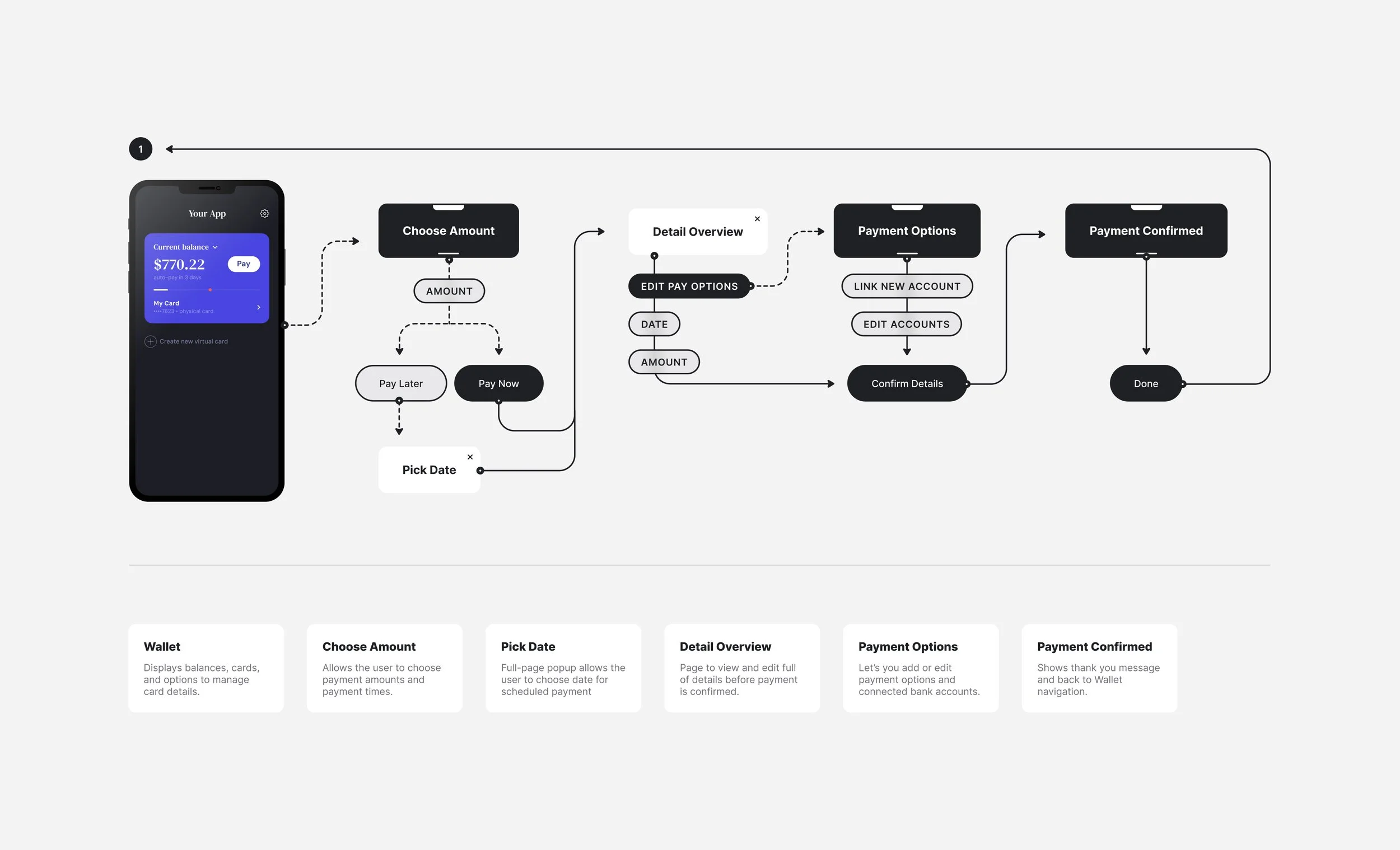
UI + Design
Decision Highlights
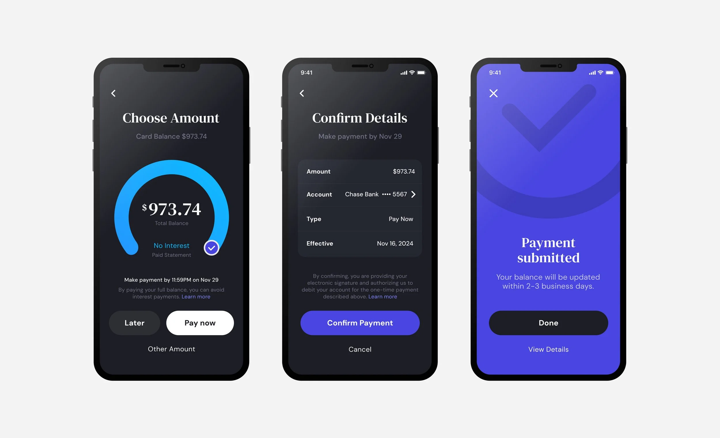
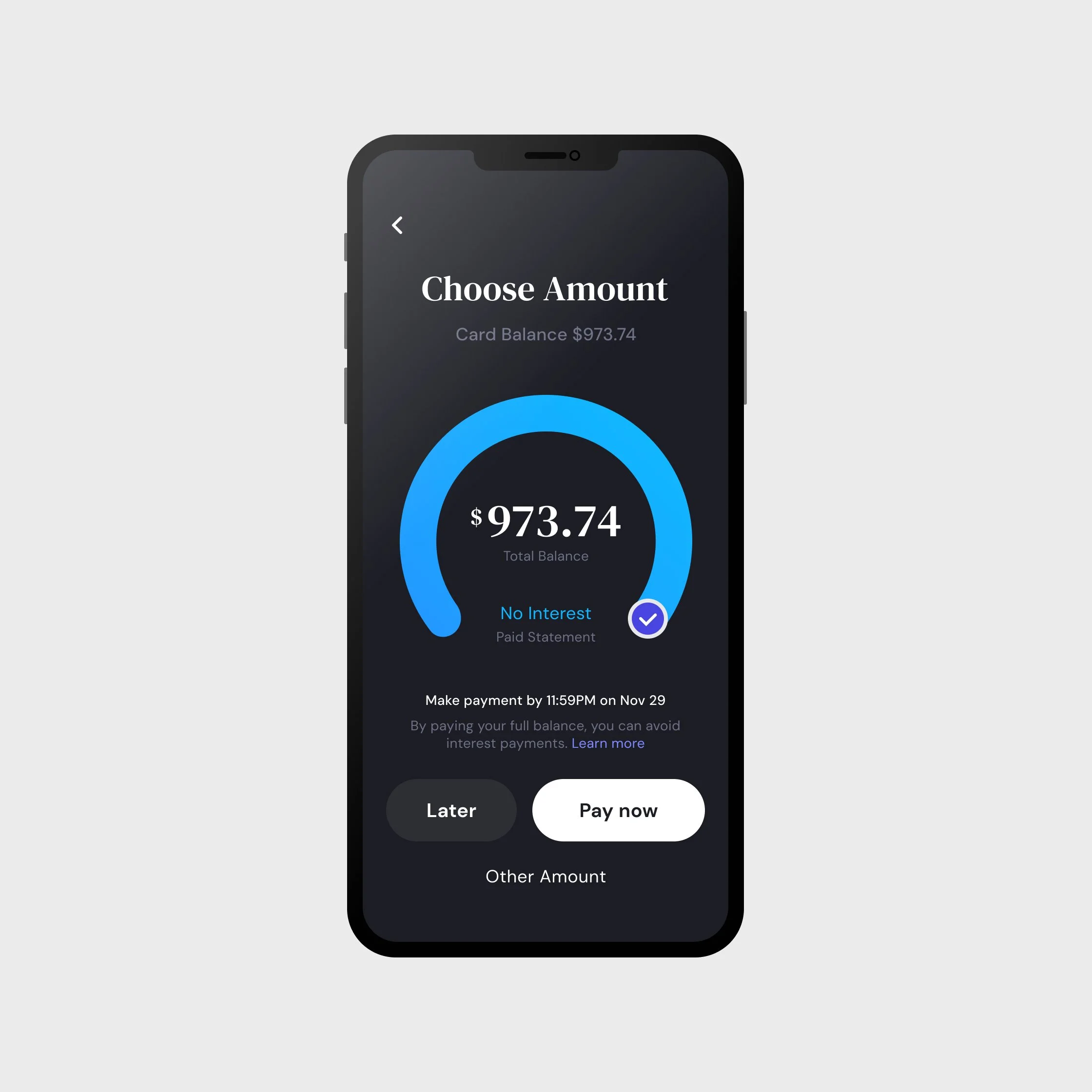
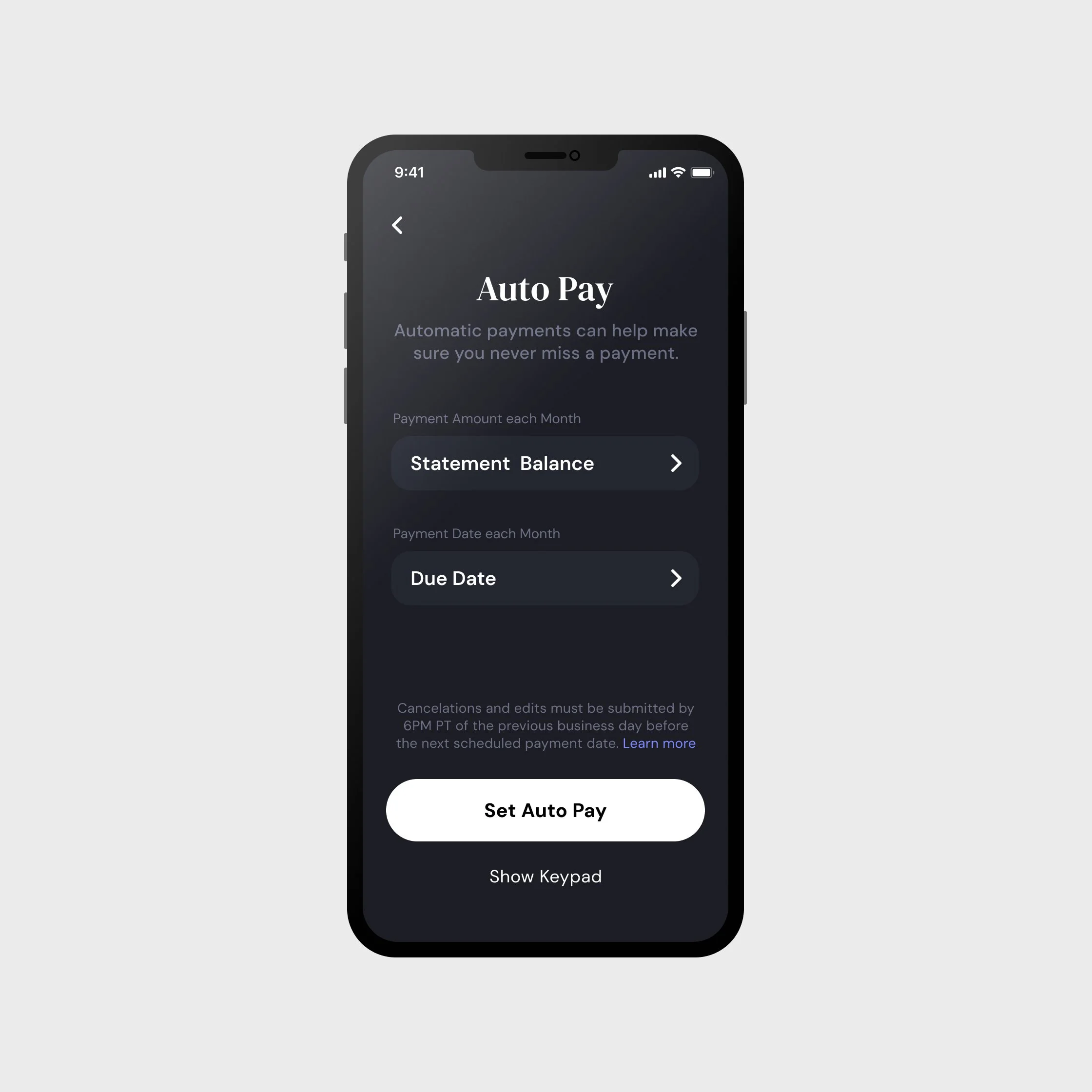
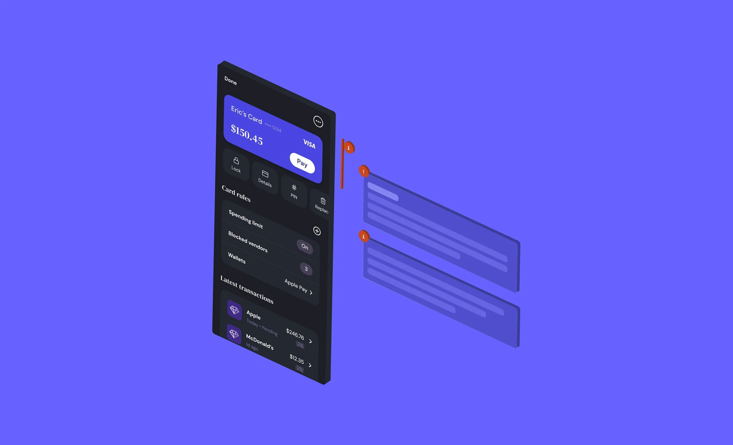
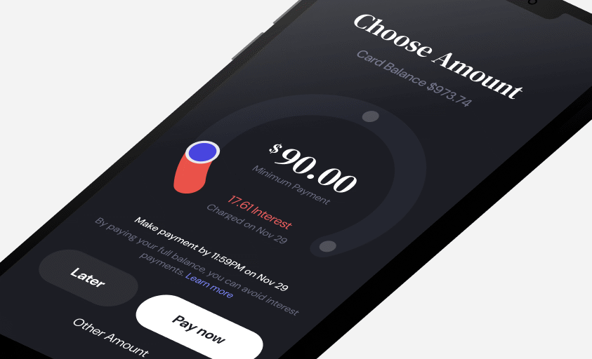
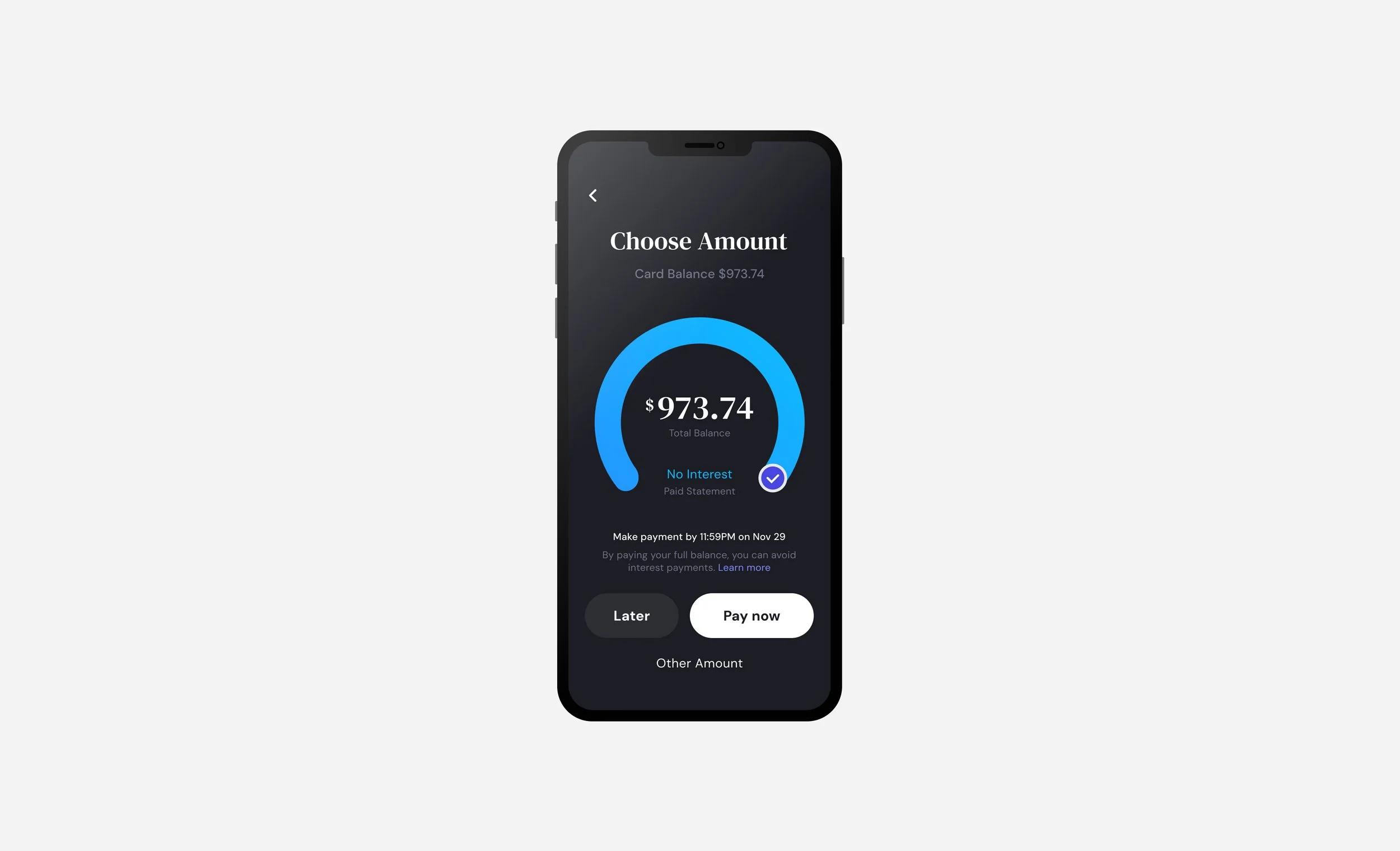
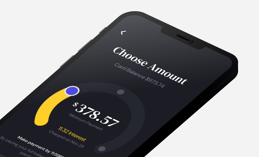
The Horseshoe Interaction
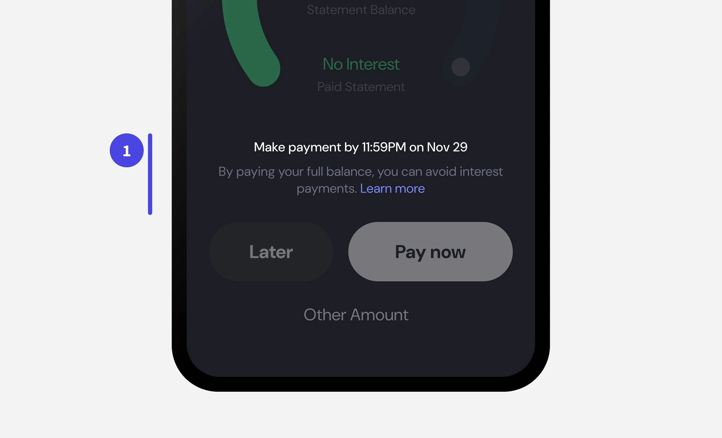
Reduced a multiple steps in the user journey into a single, intuitive slider that visualized payment option impact in real time.

Insight
Users wanted fewer steps and more clarity around payment impact. Stakeholders wanted “less steps, easy integration.”
Decision
Instead of a linear, multi-screen process, I designed a horseshoe slider where key information was upfront and engaging.
Provided immediate feedback visualizing interest based on payment amount.
Subtly encouraged healthy repayment habits by emphasizing the full repayment option in hierarchy and color.
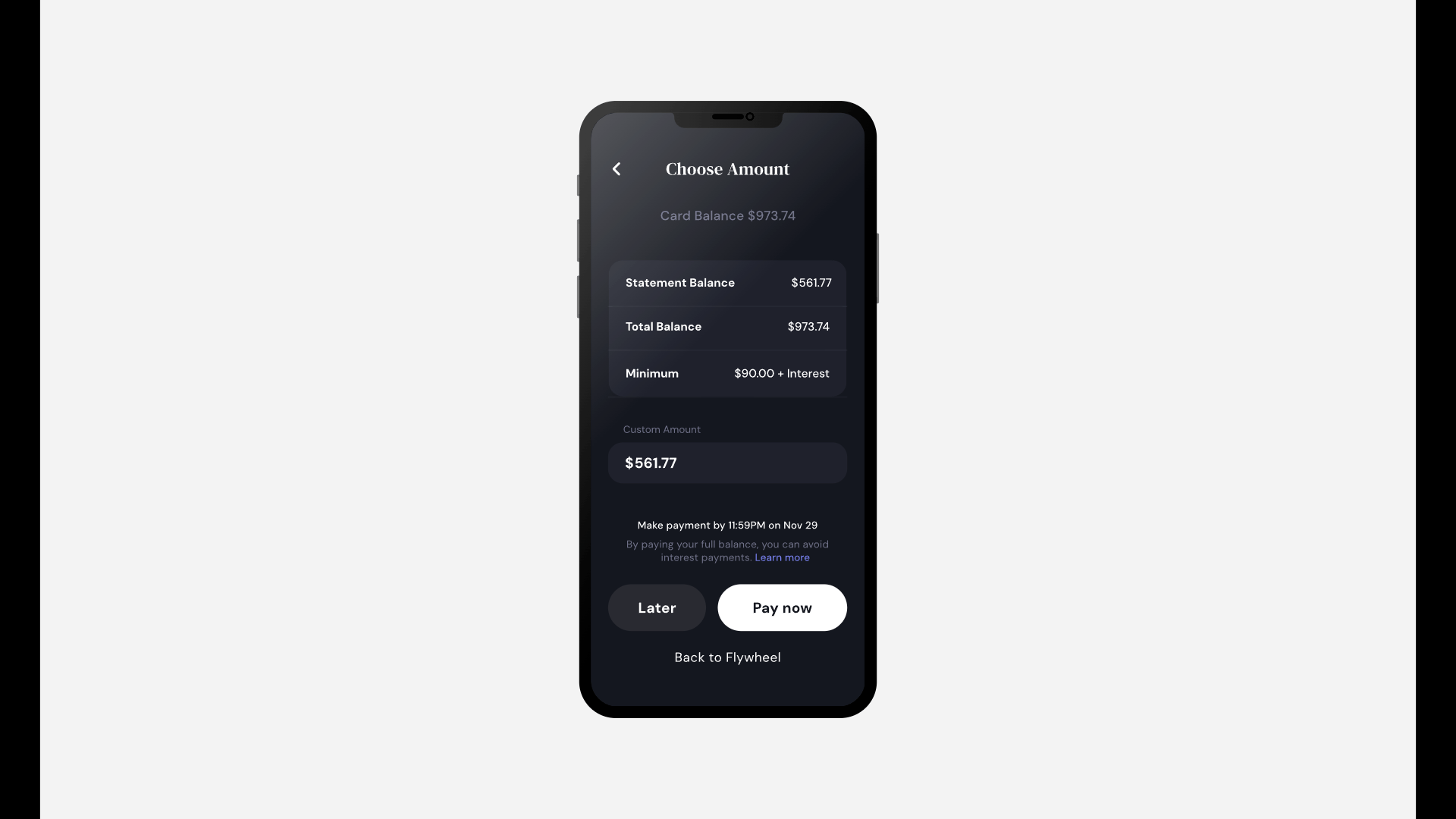
Reduced steps from multiple taps to a single “choose amount” screen as the start of separate user flows.

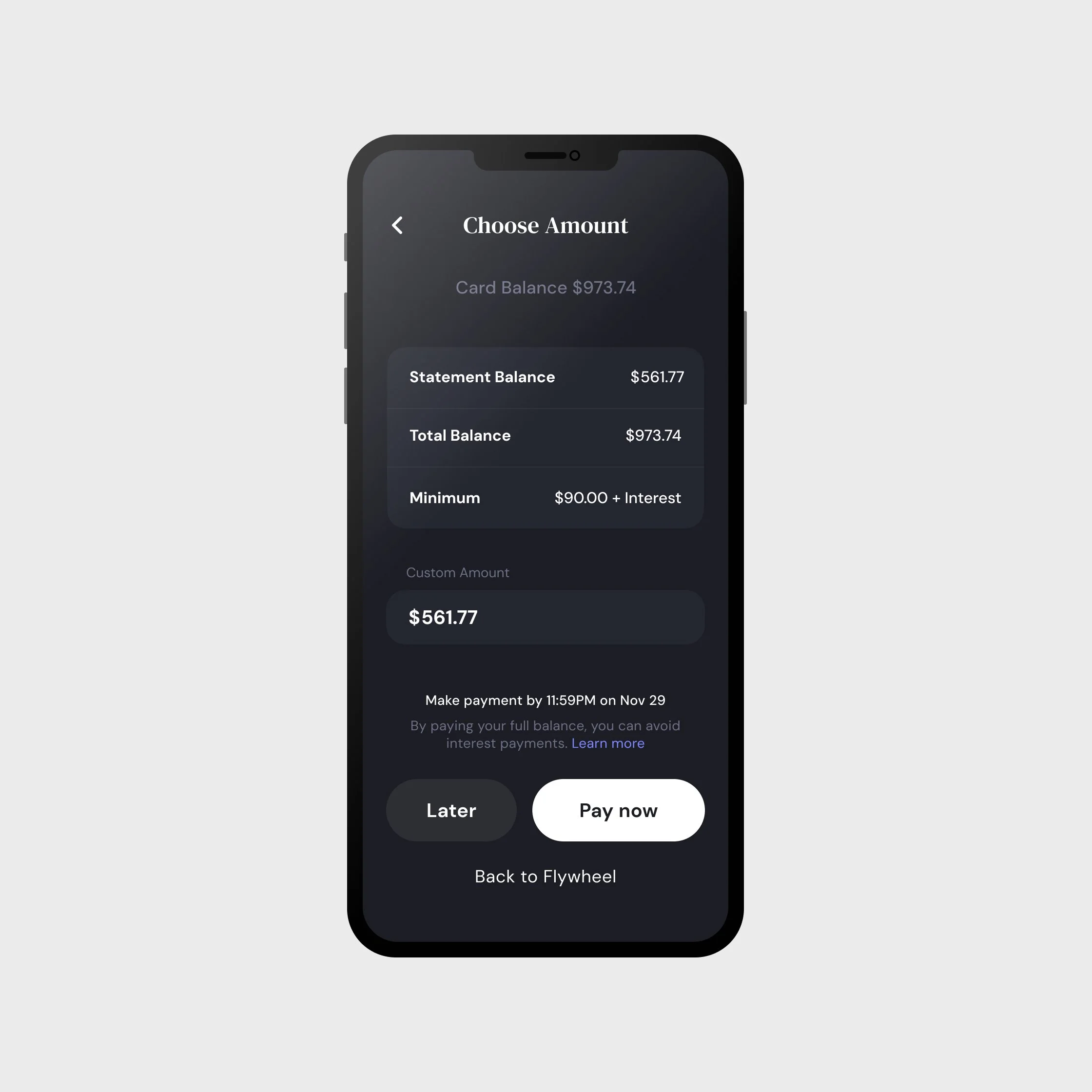
Financial Wellness & Accessibility
Designed a custom payment screen with keyboard input for accessibility, and visible recommended payment amounts for financial wellness.
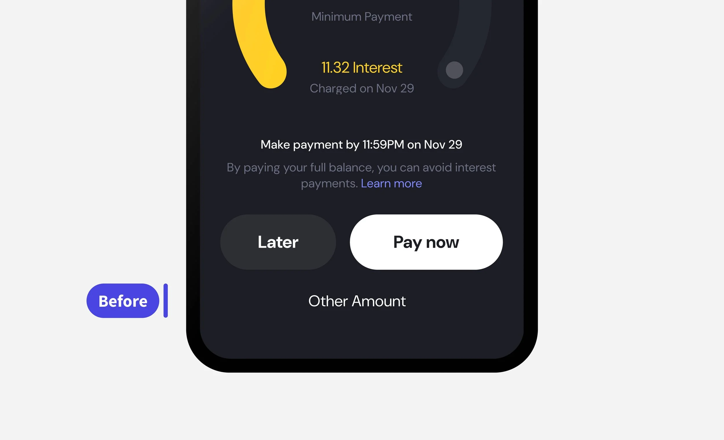
Insight
The horseshoe slider raised accessibility concerns, as it posed challenges for screen reader users and those navigating by keyboard-only input.
Decision
I designed a dedicated payment screen with:
Direct numeric input fields optimized for keyboard entry.
Visible recommended payment amounts that nudged users toward healthier financial habits.
Consistent integration with the design system so clients could apply branding without losing accessibility standards.
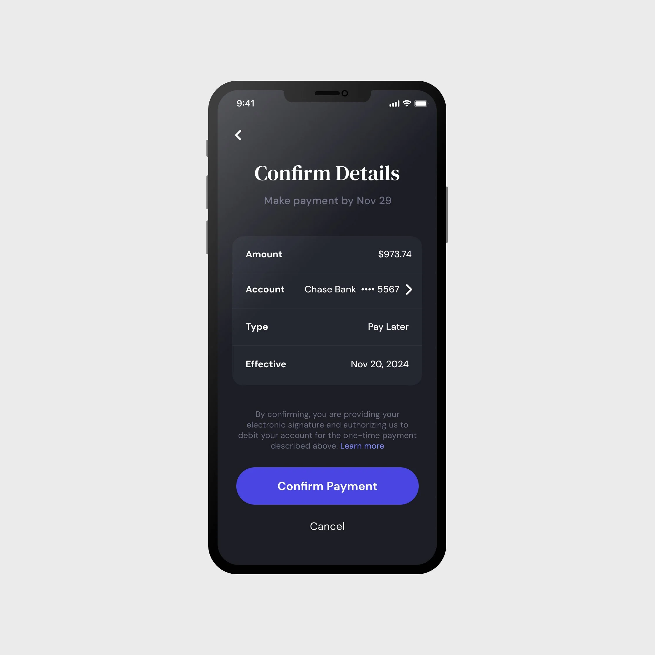
Balancing Good Design with Legal Compliance
Used progressive disclosure to keep screens clean while meeting strict compliance requirements.
Insight
Users rarely read disclosures at length and found the text overwhelming, while legal required them for airtight compliance.
Decision
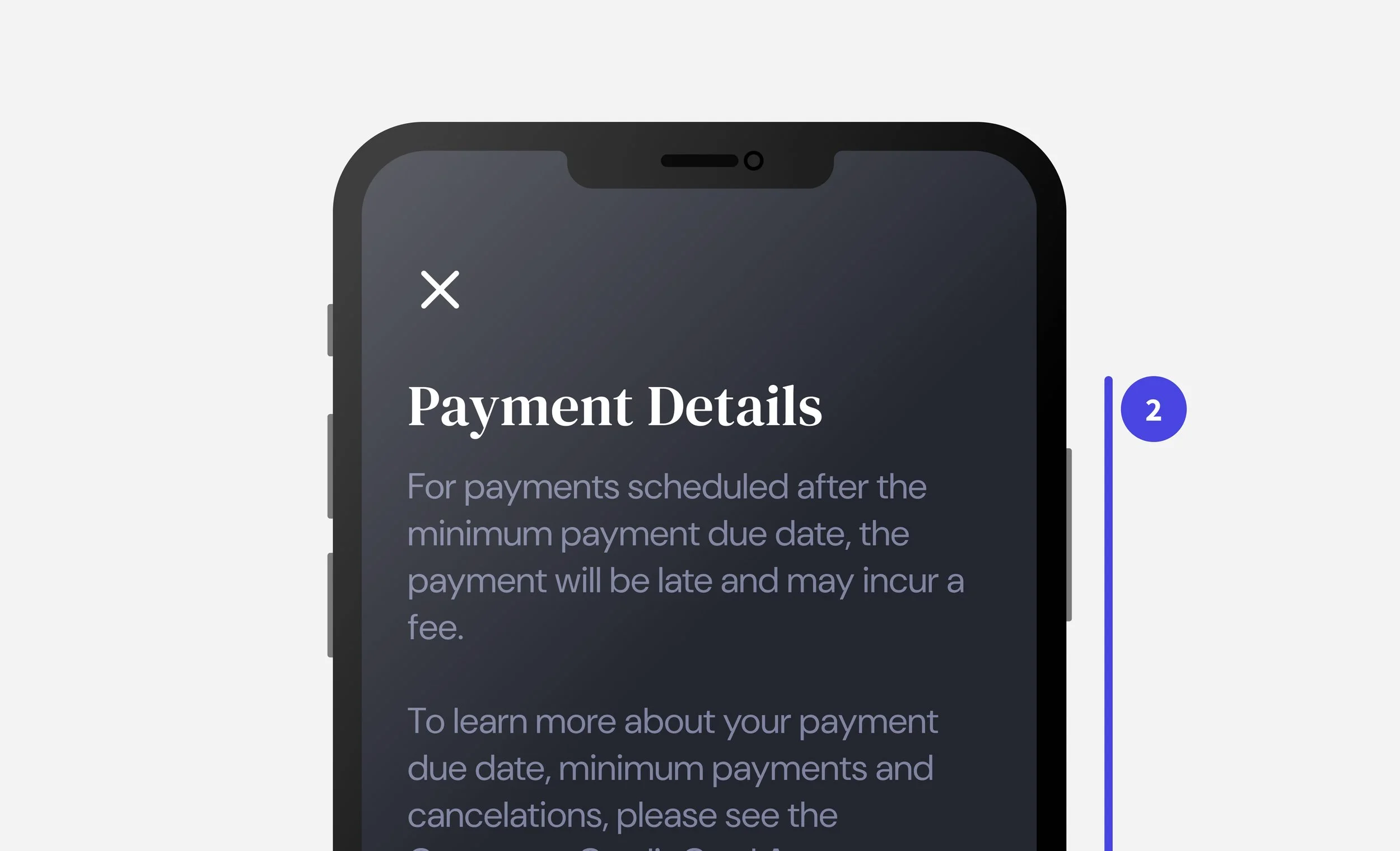
To maintain white-space on key CTA screens, I worked with legal to implement Progressive Disclosure, minimizing text on key screens and instead opting for a single “Terms and Conditions” screen at the end of the flow.
When necessary, I used popup modals to surface terms and receive confirmation in context of the flow.
Preserved the visual hierarchy of the page while meeting compliance standards.
This compromise allowed users to stay focused on payment, while legal still had clear sign-off.
Technical Constraints & Dynamic Interest
Challenged by technical constraints, I had to balance user needs, technical feasibility, and time constraints.
Insight
In competitor analysis, most flows failed to show how interest accumulates with each payment option — a major user pain point.
Motivation
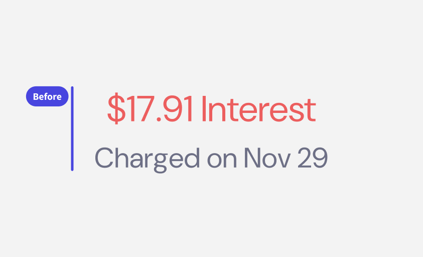
My original idea was to display a dynamic interest charge inside the horseshoe that calculated interest based on payment amount.
Feedback
Development team flagged system limitations: Interest data was reliant on partner integrations, and couldn’t be calculated until payment authorization from bank.
Collaborated with legal to create an “Pending Interest” disclosure that appears when users choose specific payment options.
Balanced financial well-being clarity and technical feasibility without misleading users.